Chicago Bears is the name of the American rugby club, which was established in 1920 in Illinois as Decatur Staleys, and a year later — Chicago Staleys, getting their current name in 1940. The team is the part of the NFL league and is known for having the biggest number of wins than any other club.
Brand Overview
Chicago Bears is a professional American soccer club that plays in the National Football League. The team is a member of the National Football Conference (NFC) North Division.
The club from Chicago, founded in 1919 and originally played as the Decatur Steelies, acquired its current name in 1922. To their credit, the Bears have won nine titles: eight NFL championships and one Super Bowl, which they won in 1985. The club is second only to the Green Bay Packers, who have 12 titles. Chicago is represented in the American Football Hall of Fame by 26 players, more than any other NFL club.
The Chicago Bears club is known not only as one of the most titled teams in the National Football League but also as a club with One of the most crucial rivalries in the league. It is the one between the Green Bay Packers and Chicago Bears, a rivalry that has lasted since their first meeting in the 1921 season.
To date, the Bears lead 94-92-6 in this rivalry, and the teams have also met twice in the postseason. The first regular-season meeting between the teams was in 1921, with the result of that game a resounding 20-0 in favor of the Bears, at the time the team was called the Staleys. The Packers recorded their first win over the Bears in the 1925 season. The 1924 game was notable because, for the first time in NFL history, two players were removed from the gamefor fighting on the field. The game ended with the Bears winning 3-0. The Bears’ longest winning streak over the Packers of eight consecutive games lasted from the 1985 season to 1988.
Meaning and history
The visual identity history of the Chicago football club can be divided into three periods. The first, Staleys, the Bear logo, and the iconic “C”, which was first designed in 1962 and became an inevitable part of the team, instantly recognizable across the globe.
What are Chicago Bears?
Chicago Bears is the name of a professional football club in the United States, which was established in 1919 in Chicago, Illinois. Today the club competes in the National Football League, has Soldier Field as its home arena, and Matt Eberflus as the head coach.
1920 — 1921
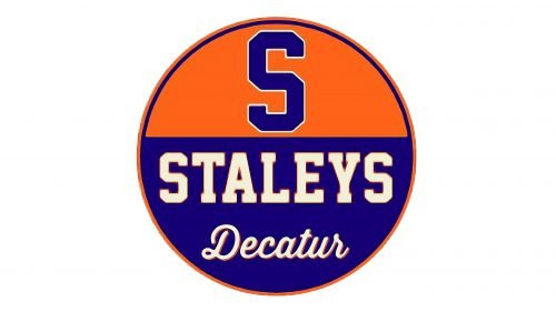
The original logo of the club was the one with the “Decatur Staleys” nameplate, as it was the first name of the team. The emblem was taken from the A.E. Staley’s business visual identity and was only used for the first year of the club’s history.
It was a circle, horizontally divided into two parts — the top one was orange, and the bottom one was blue. The bold blue “S” in a thin white outline was placed in the upper part, while the bottom one comprised the whole name of the club, executed in two different styles — the bold modern serif for “Staleys” and delicate recognizable cursive for “Decatur”, placed under. The letters of the bottom part were white with a thin orange framing, which made the whole logo look fresh and bright.
1921 — 1940
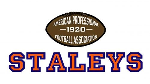
After the team mover to Chicago from Decatur in 1921, their name was changed to Chicago Staleys, and the logo was redesigned.
The version of 1921 featured a brown rugby ball with the red and blue “Staleys” inscription under it. The lettering was in all caps and featured the same style as on the previous emblem, just slightly extended and with more space.
Red letters in the blue outline balanced the calm and modest brown and white color palette of the ball, reflecting the fighting spirit of the team and its passion.
1922 — 1945
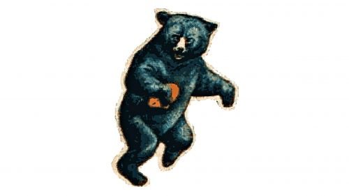
The first logo for the Chicago Bears was created in 1922, and this is when the Bear first appears on the team’s visual identity. It is a black and brown running bear with a calm orange rugby ball. It was a strong and memorable emblem, which reflected the unique character of the club, showing its power and confidence.
1946 — 1961
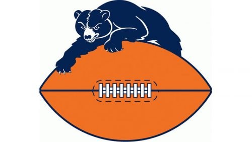
The logo version from 1946 featured a black bear on top of the orange rugby ball. The animal was crawling on the football and looked severe and dangerous. It was a graphical representation of the courage and strength of the team and their willingness to win.
As for the color palette, black and orange with white elements represented energy, dynamics, and professionalism, along with responsibility and loyalty.
1962 — 1973
The prototype of the current Chicago Bears logo was designed in 1962 and boasted a sleek stylized letter “C”, which was called “The wishbone C”. It had a sharp delicate element coming out of its left part, and making the emblem unique and recognizable. However, this logo looked pretty much the same with the badge of another sports team — the Cincinnati Reds.
The “C” was executed in white and had a thin black outline, which made it looks strong and solid on any background color.
1973 (proposed)
In 1973 there was one possible version of the new logo for the club proposed. The abstract contoured drawing in gray depicted a bear in a helm, placed in profile looking to the right. The animal looked more like a mole from the Czechoslovak cartoon. Under the image, there was a bold serif lettering in the uppercase, also in gray.
1974 — 2023
The current logo was designed in 1974 and is fully based on the previous version. The only difference is in the color palette, which is now orange, white and black, where the body of the letter “C” is orange and the double outline features white from the inside and black from the outside.
The contours of the letter were refined in order to make it look more modern and professional.
The color palette of the Chicago Bears visual identity is a representation of positive, activity and energy, along with stability and serious approach.
In 1993 another version of the logo was created — it was a white and blue head of the bear, placed over the yellow wishbone “C”. The logo was discontinued, but the bear’s head stays an essential part of the club’s visual identity until today. The only difference is that it is now executed in orange and deep blue and is more often placed inside the wordmark, replacing the letter “A” in “Bears”.
The team also uses the composition from 1993, placing an and orange and blue bear on the “C”, but more often two emblems are used separately.
2023 – Today
In 2023 the Chicago Bears logo was significantly redesigned. The only thing the designers kept was the orange and blue color palette, but the shades of both intensified. The stylized “C” is gone and replaced by the head of a roaring bear, which looks super strong and aggressive.
Symbol
Wishbone is a symbol of good luck. One good reason to introduce this symbol as part of the Chicago Bears logo was to emphasize the team’s hard work. Any effort is rewarded by excellent results and, consequently, good luck.
Emblem
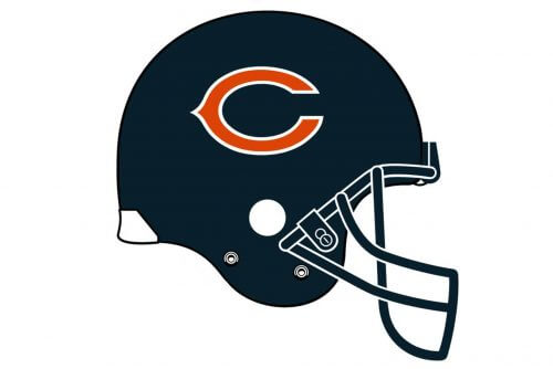
Prior to becoming the Chicago Bears logo, the wishbone “C” appeared on the players’ helmets.
Shape
The current Chicago Bears logo is the same old 1962 wishbone. However, it has changed color from white to orange with a white trim and a black outline.
Colors
The “C” wishbone was colored in orange to symbolize energy, optimism, and happiness; white stands for purity and elegance; the black color denotes excellence and perseverance.
Font
The “Bears” wordmark is written in the club’s signature typerface.
Helmet
The Chicago Bears football club has one of the most laconic helmet designs in the NFL. The players of the legendary club usually wear bright orange helmets with stylized uppercase “C”s on the sides, first introduced in 1974. The wishbone-styled letter is set in black and outlined in white. There is also another option for the helmet’s color scheme: the solid black helmet boasts bright orange letters in a thick white outline on its sides.
Uniform
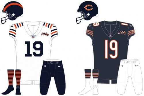
The uniform color palette of one of the oldest clubs of the National Football League, the Chicago Bears, is based on three shades: navy blue, burnt orange, and white. The most common uniform of the Bears is composed of a navy blue jersey with orange stripes in the sleeves, white numbers in an orange outline, and white pants with orange and blue stripes. The secondary version of the uniform boasts a white jersey with blue pants, and the alternate one — the burnt orange jersey with white and blue details, and white pants with blue and orange stripes.
Home field
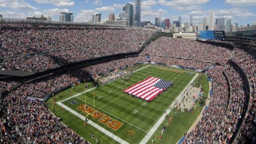
Since the beginning of the 1970s Chicago, bears have been playing on Soldier Field, a stadium in Chicago, Illinois, which was built in 1924 and renovated in 2002. For the renovation period, the club has to move to Memorial Stadium for one season, with one game held on Dyche Stadium.
Before choosing the Soldier Field as their home arena, the Bears played on Wrigley Field for almost fifty years, starting in 1921, and on Staley Field for just one season in 1919 — 1920.
Chicago Bears Colors
DARK NAVY
PANTONE: PMS 5395 C
HEX COLOR: #0B162A
CMYK: (100, 60, 0, 80)
RGB: (11, 22, 42)
ORANGE
PANTONE: PMS 1665 C
HEX COLOR: #C83803;
CMYK: (0, 75, 100, 0)
RGB: (200, 56, 3)
What does the Black Bears logo mean?
Black Bears is the name of a collegiate sports team from the University of Maine. As for its logo, it is composed of a graphical part, depicting a head of an aggressive bear, accompanied by bold blue “Maine” lettering. As you can see, there is no hidden meaning in this emblem, just a depiction of the club’s name and background
What kind of bear is the Chicago Bears logo?
The logo of the Chicago Bears professional rugby club is composed of a bold stylized letter “C” in a wishbone style, which high looks pretty much like a self-sufficient emblem, but also stands for the first letter of the “Chicago” part of the club’s name. Although, the previous version of the badge contained an image of a grizzly bear, which is considered to be the most dangerous.
Why is the Chicago Bears logo AC?
The Chicago Bears logo is not the “AC”, but the “C”. A stylized extended orange letter in bold lines with a delicate sharp element in the middle of the arch stands for “Chicago”, the city, where the club was born and is still based.
How many Super Bowls have the Bears won?
Chicago Bears is not the most titled club in the NFL and only won the Super Bowl once, in 1985. Although( the team keeps fighting and not losing the spirit to repeat its success.


