Cheetos is the Frito-Lay label of chips-snacks, introduces created in 1948. The brand is extremely popular across the globe and is distributed over all the six continents.
Meaning and history
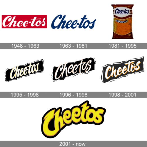
The history of the Cheetos visual identity can be split into two periods — from the brand’s establishment as Chee-tos in 1948, and the modern one that started in 1998. And during each of the two eras, the logo concept has been pretty stable, with only minor redesigns and refinements.
1948 – 1963
The very first logo for Chee-tos was introduced in 1948 and featured bold elegant lettering in white placed on a red background. The inscription was executed in a sans-serif cursive, with the solid white dot replacing the “-“ between the two parts of the brand’s name.
1963 – 1981
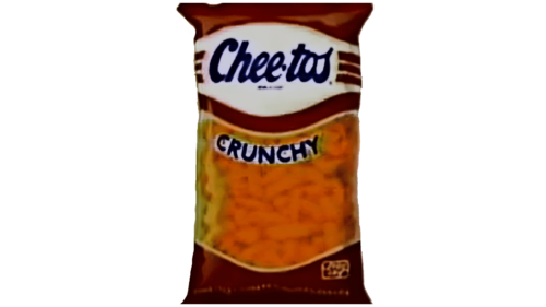
In 1963 the typeface of the Chee-tos inscription became narrower and gained more inclination of the letters. The color palette was also changed and now the logotype was executed in a darker shade of red, close to burgundy, and placed on a white background.
1981 – 1995
The typeface of the wordmark was only slightly refined in 1981, though the color palette of the brand’s visual identity turned blue and white, with some additional red details when placed on the product’s packaging.
1995 – 1998
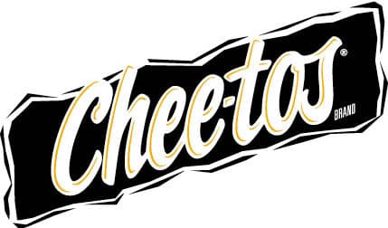
In 1995 the Chee-tos logo was redrawn in a modern way, placing the white inscription in a delicate yellow outline on a diagonally located black banner with uneven edges. It was a strong and bright badge, which became a basis for the following redesigns.
1996 – 1998
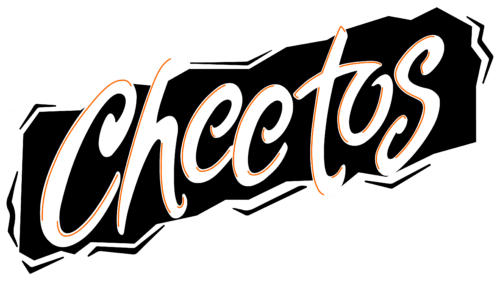
The Cheetos logo, designed in 1996, was based on the previous version, but with the contours of the letters refined, and the lines of the bars elongated. The thin yellow accents inside the white characters were replaced by the red ones. This version of the logo only stayed active for a couple of years.
1998 – 2001
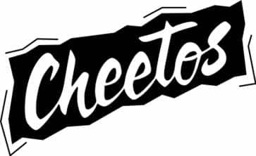
The brand changed its name to Cheetos in 1997, and the logo was redrawn in the same year. The new emblem was fully based on the previous one, but with the typeface of the inscription refined and sharpened. The color palette was simplified to a monochrome one by removing all the yellow elements.
2001 – Today
In 2001 yellow color comes back to the Cheetos visual identity, replacing white one. The new badge is composed of a smoothly arched wordmark in yellow with an orange outline, placed on a solid black background, which repeats the contours of the lettering. The typeface of the logotype boats thick lines, rounded shapes, and some sharp elements, placed on the ends of the letter-lines. The bright and remarkable emblem evokes a friendly and welcoming sense, showing the brand as a modern and progressive one.


