Chamberlain is an international brand of garage doors manufacturer, who is owned by Chamberlain Group, which operates across the globe and is one of the world’s leading companies in the industry.
Meaning and history
Chamberlain is one of the world’s leading companies in garage door production and technologies. It has been on the international market Ince the middle of the 20th century and has invented many useful systems, which simplified the life of the garage owners a lot.
Today the company has several lines of products, which vary in pricing and technologies, and it also collaborated with other market leaders, Amazon, to include the garage opening function into the Amazon Key service, available to use from the mobile devices.
What is Chamberlain?
Chamberlain is the name of an American company, which was established in 1954, and is engaged mainly in the production of garage doors, but collaborates with other companies to extend its portfolio. Chamberlain is based in Illinois, but operates all over the globe and is known to be one of the most reliable producers of garage door technologies.
1954 – 2020
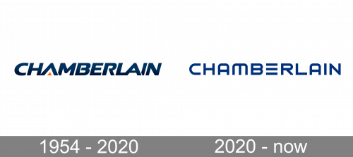
The Chamberlain logo is strong and masculine. It is composed of a wordmark with a small graphical element.
The wordmark is executed in a simple italicized typeface, which reflects the brand’s professionalism and authority, evoking the sense of trust and power.
The deep blue color of the wordmark is accompanied by a yellow detail — a small triangle under the letter “A”.
Yellow symbolizes comfort and happiness this is what the brand aims to provide their consumers with, manufacturing the highest quality garage doors, which are safe, durable and reliable.
All the Chamberlain doors can be controlled by smartphone, so innovations and technologies are the most important values of the brand, which is also shown on its logo.
2020 – Today
The redesign of the Chamberlain logo, held in 2020, has introduced a laconic and modern version of the company’s wordmark, set in the uppercase of a futuristic sans-serif font, with solid shapes and clean contour of the calm and dark blue letters. There are no graphical or color accents in the new badge, just the letter “E” which has no vertical bar.
Font and color
The uppercase Chamberlain logotype, set in a custom sans-serif font, is the only element of the newest company’s badge, and it looks strong and progressive, reflecting the character and values of the company. The font, used for the Chamberlain wordmark is pretty close to such types as Babak Bold and Shary Extra bold, but with most contours modified.
As for the color palette of the Chamberlain visual identity, it is based on a calm and dark shade of blue, which looks very soft and velvety at the same time. Blue here stands for professionalism and an innovative approach evokes a sense of excellence and stability in the company and its technologies.


