Wacom is a Japanese brand of company manufacturing high-quality displays and tablets for professional artists and designers. The company was founded in 1983 and launched its first tablet in 1984.
Meaning and history
Wacom is a Japanese company, which has been on the market for graphic tablets since the middle of the 1980s. Since the very first days of the company’s existence, it had positioned itself as the world leader in the production of graphics tablets. Wacom is the inventor of a new data input device and a sensitive pen.
The company’s mission is to create a new level of harmonious interaction between man and computer. Wacom successfully realizes its fundamental objectives, creating new solutions that facilitate and improve people’s work, enabling the use of digital technology for a wide variety of applications and by any user.
What is Wacom?
Wacom is a multinational corporation that is the world’s leading manufacturer of graphic tablets, related components, and CAD for electrical design. The company was established in Japan in 1983, and today has its subsidiaries in the United States, Germany, China, Hong Kong, Australia, Singapore, India, Korea, and Taiwan.
1983 – 2008
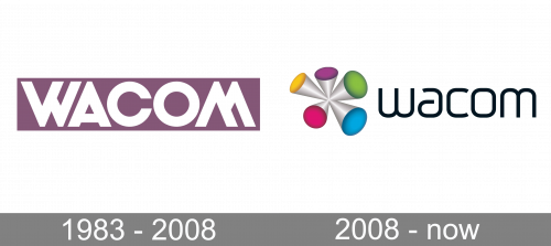
The original Wacom logo, designed in 1983, stayed unchanged for more than two decades. It was a strong and bold badge with a very simple composition: the heavy white logotype in a custom sans-serif typeface, written across the light dust-pink rectangle. The uppercase inscription has the contours of the “W” and “M” customized, with the middle diagonal bars elongated. The two features were the same shapes and were just a reflection of one another.
2008 – Today
The Wacom logo is unique and memorable. Its iconic emblem looks like no other logotype and its modern and delicate typeface is highly recognizable in the industry.
Created for professional artists, the Wacom brand has a really impressive visual identity.

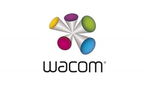
The Wacom emblem is a symbol consisting of five silver cones, connected with its peaks and each with a colored base. The emblem represents five senses and an excitement people get when working with the brand’s products.
The main colors of the logo are white for a typeface, black for a background and silver gray for an emblem with cones bases in yellow, green, blue, pink and purple. The logo looks balanced due to simplicity and monochrome of the wordmark and inspiring geometry and colors of the emblem.


