 Central Hockey League Logo PNG
The Central Hockey League (CHL) was a professional ice hockey league in North America. It was owned by Global Entertainment Corporation. The league operated from 1992 to 2014 and provided a platform for talented hockey players to showcase their skills. The CHL teams were based in various cities across the United States and Canada, attracting fans with exciting games and competitive play.
Meaning and history
The Central Hockey League (CHL) was founded in 1992 by Ray Miron and Bill Levins. It served as a professional ice hockey league in North America until its merger with the ECHL in 2014. The CHL boasted several notable achievements during its existence, including the expansion of teams across various states, a strong fan base, and the development of talented players who went on to play in higher-level leagues. However, facing financial challenges and an evolving hockey landscape, the CHL eventually merged with the ECHL to create a more robust and sustainable organization. Today, the ECHL continues to thrive as a premier AA-level professional hockey league in North America, providing exciting gameplay and a platform for player development.
What is Central Hockey League?
The Central Hockey League (CHL) was a professional ice hockey league in North America. It operated from 1992 to 2014, providing a platform for teams across the United States and Canada to compete at a minor league level.
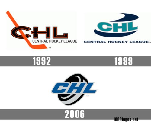
1992 — 1999
 The original Central Hockey League logo featured the letters “CHL” in black with thin red outlines. There was a hockey stick going through the “C.”
1999 — 2006
 The second CHL logo (1999-2006) depicted the same abbreviation in teal with abstract dark blue shapes above and below.
2006 — 2014
Eventually, the emblem used in 2006-2013 featured the lettering “CHL” in a dark greyish shade of blue. Like in the previous versions, there was also the full name of the league in smaller letters below. On the background, you could see a hockey puck in black and grey.


