One of the famous American Basketball teams, Cleveland Cavaliers, was established in 1970. The name of the team was given to them by the fans, who had a few options to choose from. Cavaliers, or the Cavs, are also called Musketeers sometimes, and this aesthetics is the main theme of their current logo. However, the team has a pretty long and intense visual identity history, with several completely different design concepts.
Meaning and history
Cavs, or Cleveland Cavaliers, is one of the most controversial clubs in the National Basketball Association. It had much more losses than wins throughout the years, and in the first decade after the club/s foundation, there was nothing but the losses. Although, the Cavs managed to Cath up, and won seven titles in the Central Division championships. Five titles of the Eastern Conference, and even won the NBA championship in 2016, defeating Golden State Warriors.
The club has changed many owners throughout its history, and today since 2005 it is owned by Dan Gilbert, who bought the franchise from George and Gordon Gund. As for the stadiums, Cleveland Cavaliers have been more consistent — playing on the Rocket Mortgage FieldHouse since 1994.
What is Cleveland Cavaliers?
Cleveland Cavaliers, or simply Cavs, is the name of a professional basketball club in the United States, which was established in 1970. Today the club from Cleveland, Ohio, competes in the National Basketball Association as a member of the Central Division of the Eastern Conference. Cavs have Rocket Mortgage Fieldhouse as their home arena and J. B. Bickerstaff as the head coach.
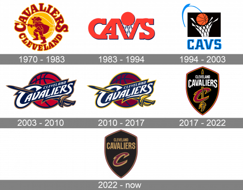
1970 – 1983
The original logo for one of the NBA teams was designed in 1970 and stayed with the club for 13 years. The insignia depicted a musketeer enclosed in a round frame with lettering. The yellow basketball was placed in the middle of the emblem, celebrating the Sport.
The color palette of the first Cavaliers logo was burgundy and yellow, a combination, symbolizing energy and power.
1983 – 1994
At the beginning of the 1980s, the team decides to go more minimalist and modern. They create a very simple yet bright logo, composed of a stylized “Cavs” wordmark, where the letter “V” is replaced by a basketball ring and has a ball above it. The color palette of the new visual identity is orange, with a delicate and light gray detail of the ring’s net.
The wordmark is executed in a bold serif font, looking neat. It is pretty well balanced, yet there is a feeling that the image is incomplete. This emblem stays with the team for almost a decade.
1994 – 2003
The redesign of 1994 brought a new style and color palette to the Cavs’ visual identity. The contemporary image of the basketball ring and a ball are placed inside a black rectangle and have the modern nameplate in black and blue under it. The new color mixture features black, blue, white, and orange shades, which reflect the reliability and strength of the club, also pointing on their passion and authority.
This emblem stayed with the team for nine years and was the last one in the experimental, non-musketeer era.
2003 – 2010
The logo design from 2003 is more elegant and remarkable than any other version, created for the team. It is composed of a diagonally placed white wordmark in a blue outline, bronze, and blue rapier and a dark red basketball with blue accents.
The inscription is written in a custom sans-serif typeface and looks sophisticated, yet sharp and confident, due to come pointed lines and elongated tails of the letters.
2010 – 2017
The color palette was slightly changed in 2010, then the yellow papers on the emblem. As for other details, they remained untouched, only the letters’ contours were refined and now they look neater and stronger.
The basketball on the background is more purple now, which makes the whole logo look serious and even a little luxurious.
The rapier on this version looks brighter and more visible due to the use of yellow color.
2017 – 2022
The new visual identity was created for the Cavaliers in 2017 and is still in use by the team today. It is a version, which is completely different from all the previous ones, yet it keeps the main Musketeers’ legacy and idea.
The black shield with a thin burgundy and yellow outline has a white wordmark on its upper part and a vertically located black and yellow rapier intertwined with the burgundy letter “C” in a yellow outline.
The emblem is perfectly balanced in terms of letters’ size and placement of the elements, along with the color palette, which evokes a sense of professionalism and expertise.
The 1983 version was a wordmark logo, in which the letter “V” was also a stylized basketball hoop, with a ball moving into it. In the following version (1993), the wordmark was given under the depiction of a basketball hoop with a ball.
2022 – now
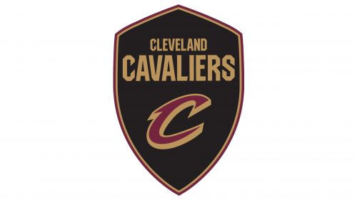
Another redesign of the Cavs visual identity was held in 2022. This was more about refining the existing badge rather than changing something, but the overall image and style have significantly improved, compared to the previous version of the Cavs badge. The vertically set sword was completely removed from the logo, and the two-lined lettering changed its color from white to gold, making the contrast with the solid black background smoother and more elegant.
Font
The wordmark sports a custom typeface, where every letter is unique. The most distinctive letters are probably the first and the last ones.
Color
Each of the team’s official colors (wine, gold, navy blue, and black) can be seen in its logotype.


