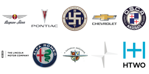
The cross is the most famous sign in human history. For most people, the first association with the cross is religion, because for two thousand years it has been the universal symbol of Christianity. But this sign appeared much earlier. Already in ancient times, the cross became a sacred sign. The cross was associated with various rites, myths, legends, superstitions, and rituals. It was part of the ornaments, became the basis for the construction of houses and temples, minted on coins.
Today the image of the cross is also very popular among automakers. Many car brands around the world use the cross as a basis for their logos. In the case of autos, the Cross is rather a symbol of reliability, security, and stability. Below we will take a closer look at the most famous car logos with crosses. Let’s get started.
Alfa Romeo
One of the most elegant logos with a depiction of the cross in our selection is the emblem of the Italian Alfa Romeo company. It is a very heraldic badge, with its history. The Red Cross from the coat of arms of Milan and a crowned serpent devouring a man is depicted here. The design of the logo is based on the legend of one of the founders of the Lombardi Visconti family of Milan killing a Saracen who had a man-eating serpent on his shield.
Chevrolet
The Chevrolet cross is gold and silver and has been with the company for decades. It is a stylized Swiss cross, associatively speaking of the company’s name. The first image of a cross on the Chevy logo appeared back in 1914, and since then the emblem has gone through a huge number of modifications but has retained its original contours, and today is one of the most recognizable car logos in the world.
HTWO
The minimalistic and laconic cross from the logo of the HTWO car brand is not just a graphical element, but also a part of the stylized monogram. The progressive brand, focused on the production of electric vehicles, shows its modern and innovative approach to business in its logo too. The bright blue color works as a signifier here, and the clean contours of the cross and the two vertical lines on its sides show stability and excellence.
Hispano-Suiza
Hispano-Suiza is not the most famous brand from our list, as it was mainly popular in the middle of the last century, with a long break until the end of the 2010s when the marque was revived in order to start the production of electric cars. The history of the creation and development of this brand is very well reflected in its logo: a circle, in which the symbols of the Swiss and Spanish flags are inscribed, and two open wings with a propeller in the center of this circle. The founder of the brand, Marc Birkigt, was Swiss by birth but moved to Spain at the beginning of the 20th century.
K-R-I-T Motor Car
Another not-very well-known brand with a cross on its logo is K-R-I-T Motor Car. It was an American marque, which only existed for seven years, from 1909 to 1916. The cross on the logo looks more like a Swastika, with broken lines and clear outlines. Since the company existed long before World War II, there can be no connection to the Nazis, but today it still looks very controversial.
Lincoln
On the meaning of the stylized cross on the Lincoln emblem, there are several versions. Some claim that it is a compass, the arrows of which are turned to the four sides of the world. This demonstrates the brand’s intention to spread its cars around the world. Others argue that the emblem, often called the “Lincoln Star”, is a celestial body that reflects the wealth and solidity of the brand. Still, others argue that the badge has no real meaning at all. It’s good to have a choice.
Meteor
Meteor is a historical brand, which was used for the Ford sedans in Canada. Internationally, the brand was not very famous, yet it had a very exquisite heraldic logo. The crest in red, gold, and silver was overlapped by an enlarged silver cross with pointed ends of the bars, and an extended horizontal bar. The cross here also looks more like a star, standing for excellence and height quality.
O.S.C.A.
Another historic brand on our list is O.S.C.A. This is an Italian manufacturer of racing and sports cars created by the Maserati brothers in 1947 in San Lazzaro di Savena, Bologna, and closed in 1967. Its elegant heraldic logo contains two red crosses in its central part. The red of the crosses is beautifully supported by the intense blue and white, making up one of the most popular tricolors in the visual identity design.
Polestar
The first Polestar logo looked quite simple: it was a sky-blue rectangle with the name written on it in silver lowercase letters. Next to the inscription, there was a stylized star with four rays and a circle in the center. Today, the automaker’s logo is more laconic, so the four-pointed star has become more like a cross, with strict contours and straight lines. The cross-star of the Polestar brand is super chic and progressive, one of our favorites.
Pontiac
The new Pontiac badge, which replaced the Indian head emblem in the middle of the 1950s, resembles a dart because of the shape of the red arrowhead, framed by a thin border and facing downward. The red surface of the arrowhead is diluted by a small silver cross, which also, as in many other logos, looks very much like an elegant four-pointed star. This quite minimalistic combination has remained with a legendary car brand for decades.
Subaru
We are sure, that many of you already know the history of the Subaru logo, and that it is based on the constellation of the Pleiades, a part of the constellation of Taurus, where each of the six stars represents one of the six companies that made up Fuji Heavy Industries. But for those, who know nothing about the brand, the six stars do really look like six stylized crosses, which look beautifully on a solid blue background, framed in a silver oval.


