Carex is the name of a self-care and hygiene products brand, which was established in the USA in 1988. Today the brand is known worldwide as a reliable manufacturer and distributor of in-home self- and health-care items and bath products.
Meaning and history
Carex is a brand that cares about the health and well-being of its customers, and this is what you can see in its name, in its products, and even in its logo. The brand was founded at the end of the 1980s, and less than five years the healthcare products of Carex could already be seen on the shelves of stores all over the globe.
What is Carex?
Carex is a self-care items producer from the United States, which was established in 1988. The brand is known for its high-quality products for in-home self-care and safety. Carex is mostly known for its wheelchairs and accessories, along with safety handles and canes.
Carex is a brand, aiming to help its customers to get through hard days more easily and comfortably. The company has a wide range of goods, which help feeling and moving better after traumas and injuries: wheelchairs, rolling steps, canes and all the possible small yet essential accessories.
As for the visual identity of Carex, it has always been a very confident and professional graphical representation of the main brand’s ideas and values — care and support.
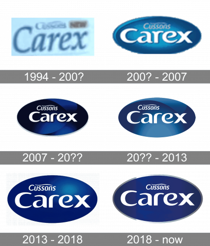
1994 – 200?
The badge, used by Carex during the last years of the 20th century, features a light blue horizontally-oriented rectangle with a smooth elegant blue lettering over it. The inscription was set in a slightly italicized cursive with curved lines of the letters, which were not connected to each other.
200? – 2007
The first redesign of the 2000s changed the concept of the Carex logo, placing the bold white logotype on a glossy blue ellipsoid. The wordmark was set in the title case of a fancy custom font with bold letters boasting playful slightly curved ends. The white Carex logotype was accompanied by a smaller “Cussons” set in thin slanted letters above it and complemented by a waving line on top.
2007 – 20??
The redesign of 2007 made the Carex badge bigger and darker, keeping the original size and style of the lettering unchanged. The surface of the dark blue ellipsoid featured a gradient pattern with a stylized “X” on its left side. The enhanced and darkened shade of blue made the badge look stronger and more professional.
20?? – 2013
With another redesign, the contours of the letters got cleaned and refined, and the background of the badge got its shade lighter and softer. The new color scheme of the logo made the brand look kinder and evoke a sense of care and warmth. Blue is the commonly known symbol of protection and security too, so this new badge represents the brand in its best.
2013 – 2018
In 2013 the Carex logo got redesigned again, with the stylized “X” patterns on the badge replaced by a circular light spot. The surface of the logo got darker and its gradients were now more matte than glossy. As for the “Cussons” and “Carex” inscriptions, they remained untouched, still written in white and set in their usual places.
2018 – Today
The Carex logo, introduced in 2018, got the glossy blue surface replaced by a flat one, although this slight simplification of the badge was balanced by the addition of a silver frame to the logo. The “Cussons” logotype was moved from the left part of the badge to the center, as for the main wordmark, it remained untouched.


