Care Bears is a popular line of colorful bear characters that originated in the early 1980s. Owned by the American Greetings Corporation, these plush toys quickly expanded into an iconic franchise, comprising of television series, movies, toys, and other merchandise. The Care Bears operate primarily in the realm of children’s entertainment, captivating the hearts of millions worldwide with their unique personalities and symbols on their bellies. Their main goal is to share and teach the values of love, care, and friendship. From the USA, the Care Bears have reached global recognition, making them universally cherished figures in the children’s entertainment industry.
Meaning and history
The Care Bears, a line of vibrant bear characters, were introduced to the world by the American Greetings Corporation in the early 1980s. These endearing bears, each adorned with a distinct symbol on its belly, represented various emotions and feelings. Over the decades, Care Bears have seen considerable success in the children’s entertainment segment, from animated TV series and movies to toys, apparel, and books. Notable achievements of the franchise include multiple animated series, a presence in the Macy’s Thanksgiving Day Parade, and collaborations with notable brands. Today, the Care Bears remain a prominent brand, continuing to inspire love, care, and friendship among new generations.
What is Care Bears?
Care Bears is a renowned children’s franchise, originating from the 1980s as colorful bear characters by American Greetings Corporation. These bears, each bearing a unique emblem, aim to promote love, care, and friendship, expanding over the years into TV shows, movies, and merchandise.
1983 – 1985
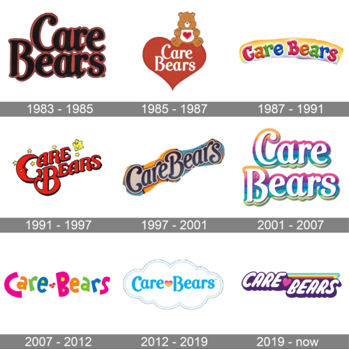
The initial logo features a vintage and bold font, conjuring feelings of nostalgia. The words “Care Bears” are depicted in a rich, cherry-red hue with outlined detailing, giving the typography depth and dimension. The font style, reminiscent of the 80s and 90s, transports us back to a time of Saturday morning cartoons and cozy childhood memories. The way the letters curve and intertwine subtly embodies the caring and interconnected nature of the Care Bears themselves.
1985 – 1987
Taking a more illustrative approach, the second design centers around a large, bold heart in a deep red hue. Seated atop this symbol of love is an adorable Care Bear clutching its own tinier heart. The brand name, “Care Bears”, is inscribed within the heart, emphasizing the theme of love, care, and affection. This logo perfectly encapsulates the essence of the brand, showcasing not only the titular bears but also their primary mission: spreading love and care to all.
1987 – 1991
A spectrum of colors brings this design to life. The “Care Bears” name is spelt out in a delightful gradient of letters, transitioning smoothly from one vibrant hue to the next. The playful and curvaceous font appears almost three-dimensional, like soft, pliable clay. This design speaks to a younger audience, evoking joy, playfulness, and a world of imagination.
1991 – 1997
This emblem stands out with a celestial theme, with the name “Care Bears” enveloped by a sleepy crescent moon and twinkling stars. The ruby-red typography is adorned with little starbursts and an especially cute, cheerful star character at the top. The design evokes feelings of nighttime tales, dreams, and the magical universe the Care Bears inhabit. It’s a reminder that even in the vastness of the universe, care and love reign supreme.
1997 – 2001
This logo showcases the name “Care Bears” in a swanky, curved ribbon style. The design flows from left to right in a gentle S-curve, with the typography echoing a blend of modern and vintage flair. The words are colored in a soft white, which contrasts brilliantly against a layered backdrop of cerulean blue and mustard yellow, giving the logo a sense of depth and dimension. The bordering outlines accentuate the logo’s overall shape, reminiscent of cloud trails or soft candy twists.
2001 – 2007
Embracing the soft palette of dreamy pastels, the next logo displays the “Care Bears” name in a bubbly, rounded font that seems to playfully float. Each letter possesses a gradient transition from one hue to another, mirroring the magical, ever-changing skies of Care-a-Lot. It’s a design that combines whimsy with tenderness, encapsulating the nurturing spirit of the brand..//
2007 – 2012
Bold, bright, and undeniably cheerful, this logo displays “Care Bears” in multi-colored letters, each adopting a distinct hue from a radiant rainbow. The word “care” is designed with rounded and smooth edges, while “bears” presents a playful heart between the two words. The variety of colors emphasizes diversity and unity, much like the different personalities of the Care Bears, who always come together in the spirit of love and care.
2012 – 2019
Taking a more minimalist yet detailed approach, the final design showcases the brand name nestled within a soft, cloud-like outline. “Care Bears” is written in a gentle blue hue, while a small, pastel heart centered between the words adds a touch of warmth and love. The entire design, outlined in a subtle gray, encapsulates a feeling of serenity and comfort, reflecting the cozy and protective environment the Care Bears provide.
2019 – Today
The Care Bears logo presented captured the eye with its vivacious use of color and fluid typography. Predominantly in a rich shade of purple, the name “CARE” stands bold and pronounced, offering a sense of assurance and warmth. Each letter is voluptuously shaped, suggesting a soft, cushioned feel, which resonates perfectly with the comforting nature of the Care Bears themselves.
Nestled between “CARE” and “BEARS” is a delicate pink heart, which not only adds a touch of affection but also ingeniously bridges the two words. This heart epitomizes the core essence of the brand: love, care, and boundless affection. The word “BEARS,” while maintaining the plump typography of its predecessor, gets a touch of playfulness with a multicolored streak running atop it, incorporating the cheerful spectrum of a rainbow. This vibrant strip stands as a symbol of the diverse characters and personalities within the Care Bears universe.
The choice of a deeper purple shadow beneath each letter gives the design depth, making the words appear almost 3D as if they’re ready to pop out and embrace the viewer. It’s a logo that marries modern design techniques with the timeless values the brand represents: love, unity, and joyful caring.


