

![]() Canal 13 Logo PNG
Canal 13 Logo PNG
Canal 13 is the name of one of the most popular TV-channels in Chile, which was established in 1959 as Canal 2 de la Universidad Catolica de Chile. One of the oldest channels in its country, today Canal 13 is owned by the Luksic group and has three subsidiary tv-channels and one radio.
Meaning and history
![]()
For the first two years after its launch, the Chilean channel had no official logo at all. But things changed after it was moved to a new frequency and switched its name from Canal 2 de la Universidad Catolica de Chile to Canal 13.
Though the number “13” became the main symbol on the channel’s logo, there was quite a long period in Canal 13 history, when the logo featured no numbers at all — it lasted for more than two decades.
1961 – 1970
![]()
The very first logo of the channel was executed in a dark and strict color palette composed of gray and black. The composition consisted of two black rectangles — one big vertical, with a gray “13” on it, and a smaller rectangle under it, stretched horizontally, with the “TV” lettering.
1970
![]()
The redesign of 1970 made the logo look modern and cool with the black and bold “13” placed above the custom lot written “TV” in white with a black outline. The confident lines and wide shapes of all symbols made the badge look stylish and solid.
1970 – 1972
![]()
The channel was renamed Corporación de Television de la Universidad Catolica de Chile in 1979, and the logo was redrawn again. The new composition featured a black square with arched sides and rounded angles, resembling an old TV screen, and white symbols on it. The main part of the screen was taken by a stylized white “TV” in the lowercase with the horizontal bar of the “T” merging into “V”. In the square, formed by the negative space between two letters, there was a small yet bold “13” written in white, and above the monogram — a lightweight sans-serif “Universidad Catolica de Chile” inscription in all capitals.
1972 – 1978
![]()
The upper line of the lettering was removed and the “13” was replaced by the “UC”, standing for the Universidad Catolica de Chile in 1972. The lines of all the white elements on a black background were cleaned and strengthened.
1978 – 1979
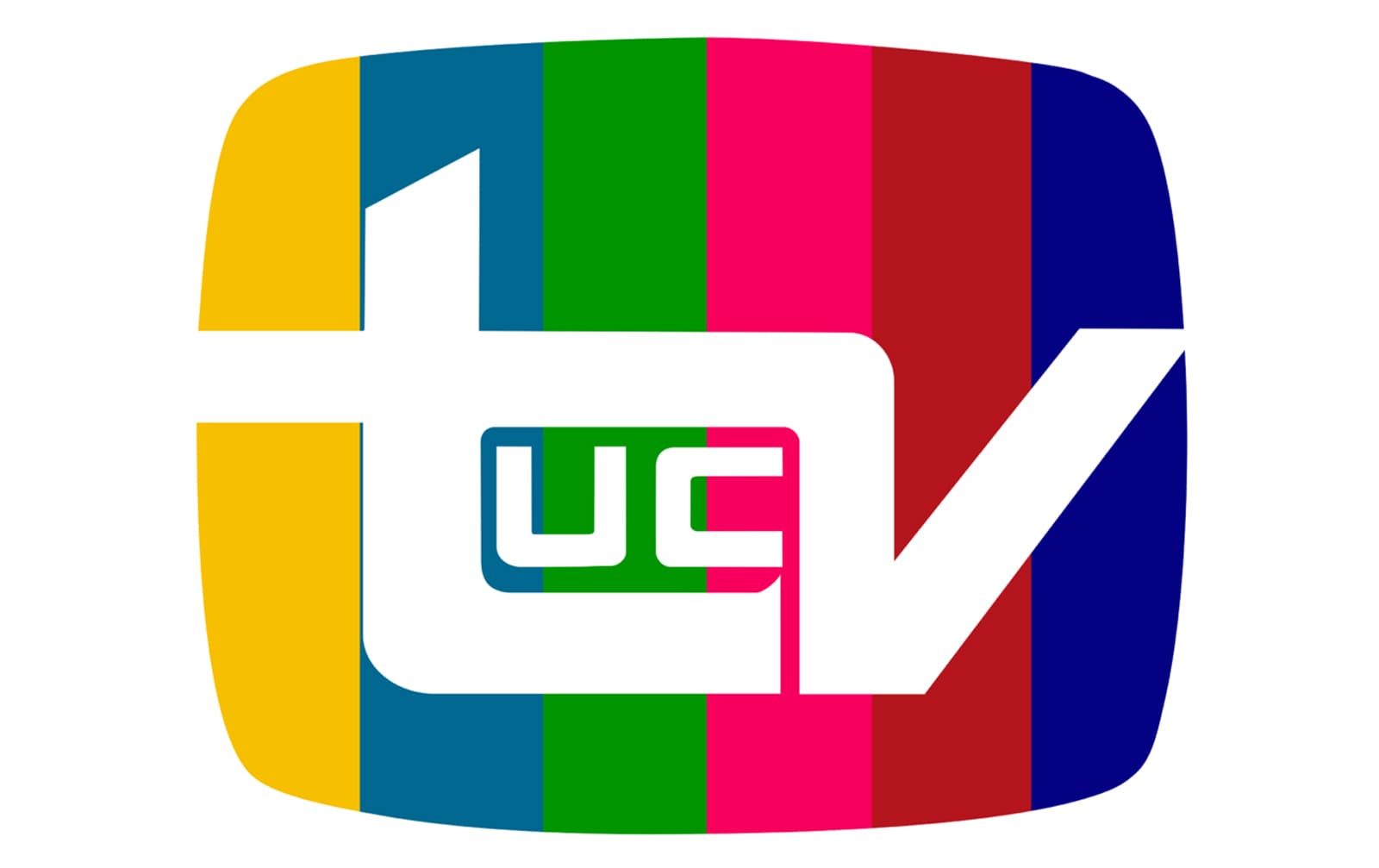
![]()
The redesign of 1978 changed the black background of the Canal 13 logo to a colorful and bright one. The new “screen” featured a multicolor vertically striped pattern, resembling the color bars when the tv channel was undergoing some works.
1979 – 1999
![]()
In 1979 the bright and delightful color palette of the channel’s visual identity was changed to dark blue and white, which looked calm, reliable, and professional, evoking a sense of expertise and authority.
1999 – 2000
![]()
The name of the channel was changed back to Canal 13 in 1999, and the number returned to the logo. The new design of the badge featured a modern sans-serif “Canal” inscription in black capitals, placed on the left from the enlarged blue “13” enclosed in a blue circle, with the monochrome solid dot and “UC” lettering on it, placed on the upper right part of the blue frame.
2000 – 2002
![]()
In 2000 the color palette of the logo was changed, its lines — refined, and the “13” and “UC” exchanged their places. Now the “Canal” in thin yet strict lines was colored gray, the “UC” in a circular frame — bright blue, and the “13” was written in white on a small gray circle, placed on the upper part of the UC’s frame.
2002 – 2005
![]()
The color palette of the logo was evolved in 2002, and now all the elements of the composition were executed in a royal blue shade and placed on a white background. The lines of the emblem were emboldened and strengthened, adding balance and power to the channel’s visual identity.
2005 – 2010
![]()
The new logo was introduced by Canal 13 in 2005. It was a solid orange circle with a smooth arched line in white placed on its upper part. Under the arch, there was a modern sans-serif “UC” lettering, also in white, and the strict narrowed “13” placed inside the letter “C” and executed in the same color.
2010
![]()
For a few months in 2010, the channel used another variant of the logo — a solid orange circle with a white enlarged “13” in the middle and a smooth white arch under it. The small “UC” capitals in a traditional sans-serif typeface were placed under the arched, written in white color.
2010 – 2018
![]()
The “UC” lettering was removed from the channel’s visual identity in November 2010. Now the simplified composition with a white number “13” standing on a white arch and placed on a solid orange background started looking more balanced and modern due to the absence of extra details and the cleanliness of its bold lines.
2018 – Today
![]()
The color palette of the logo got reversed and the lines softened in 2018. Today the Canal 13 logo featured a rounded orange number “13” standing on a smooth bold orange arch, placed on a white background. The logo looks progressive and dynamic.
Font and color
On the current Canal 13 visual identity there is no lettering, just the number “13”, executed in soft thick lines with rounded angles yet solid and confident shapes. The arched underline adds playfulness, yet also stabilizes the composition.
The combination of orange and white colors on the Canal 13 logo stands for the energy, speed, and reliability of the channel, as well as its willingness to grow and follow all the latest trends in providing its customers with informational and entertaining content.


