Butterfinger is a brand of a chocolate bar, produced and owned by Ferrero since 2018. The label was established in 1923 in the USA and is loved and distributed across the globe.
Meaning and history
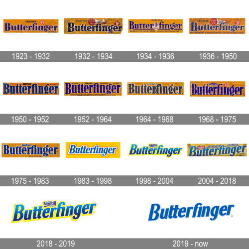
Until the acquisition of the Nestle company by Ferrero, the Butterfinger visual identity was based on the Nestle signature colors — blue and yellow. The blue bold lettering was placed slightly diagonally and featured a thick yellow outline.
1923 – 1932
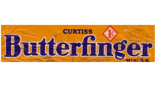
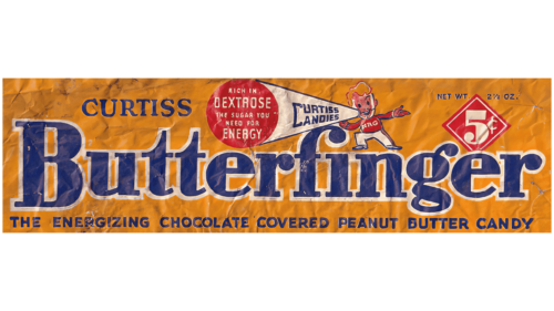
The original logo for Butterfinger was introduced in 1923 and stayed with the brand for nine years. It was a dark yellow horizontally-oriented rectangle with bold blue lettering in a white outline on it. Above the main logotype, there was a delicate “Curtiss” inscription in all capitals and a white rhombus in a red outline with the “1c” price mark.
1932 – 1934
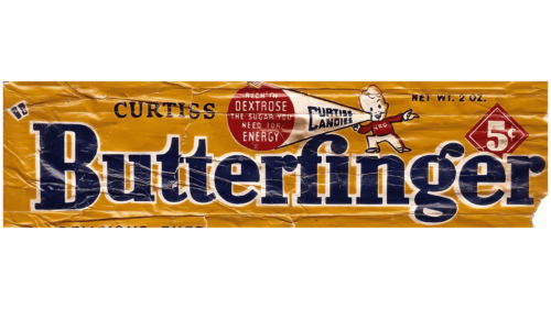
The redesign of 1932 made the inscription bolder and wider and added a funny and friendly image above it. The image depicted a boy in a red shirt with an enlarged loudspeaker in his hands. Lon the white body of the loudspeaker there was a blue “Curtiss Candies” inscription, and the solid red dot on its end also had a white delicate additional lettering on it.
1934 – 1936
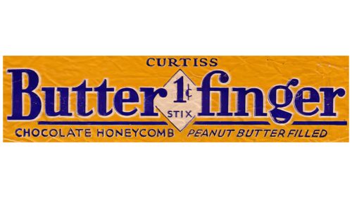
The funny boy was removed from the Butterfinger visual identity in 1934. The inscription changed its typeface to a more elegant serif one, gained a thick blue and white outline and a white “1c” rhombus was now separating the two parts of the brand’s name.
1936 – 1950
The boy in a red shirt came back to the Butterfinger logo in 1936 and stayed for more than a decade. The price changed to “5c” and it was now written in bold white lines on a solid red rhombus in a double white and red outline.
1950 – 1952
The redesign of 1950 made the Butterfinger visual identity stricter and more laconic. Now it was just a narrowed bold serif inscription in blue with a white outline, placed in a dark yellow background.
1952 – 1964
In 1952 the blue color of the logo became brighter and darker color while the yellow gained lighter and fresher shade. With the refreshed color palette the Butterfinger logo started to be more eye-catching and modern.
1964 – 1968
In 1964 the lettering on the brand’s logo became light-blue, almost white, and the main accent was moved to the bright yellow background, which was a reflection of the energy, movement, and growth of the brand.
1968 – 1975
The redesign of 1968 brought back the bright blue color palette of the brand’s visual identity and refined the lettering, making it look more modern and elegant with the neat contours and rounded angles of the letters, which were placed very close to each other.
1975 – 1983
In 1975 the color of the Butterfinger’s emblem background was switched to mustard, and the logotype was refreshed. Its letters now had more space between each other and their white outline became a bit thicker to make the whole composition brighter and the contrast between the new shade of background and the logotype — stronger.
1983 – 1998
In 1983 the logo of the brand was modernized and red Hershey. The new lettering in a custom typeface looked more professional than ever before, and the color palette gained one more shade. Now it was a blue inscription with a double white and mustard outline placed on a light yellow background.
1998 – 2004
The iconic Nestle logotype was placed above the brand’s name in 1998. Both parts of the lettering were executed in gradient blue color with the “Butterfinger” made three-dimensional. The yellow of the background became even lighter than on the previous versions
2004 – 2018
The redesign of 2004 placed the logotype diagonally and accompanied it with a white Nestle emblem in a red stylized heart. The emblem was outlined in white and added a touch of professionalism and love to the product’s packaging.
2018 – 2019
The diagonal lettering was redrawn flat in 2018. Though it still featured a gradient blue color as the main, it now looked completely different from the previous version. As for the Nestle badge, it was placed above the nameplate in dark blue, with no bright colors and framing.
2019 – now
However, in 2019 the brand had to change its logo. The current Butterfinger wordmark still uses blue as the main color, but yellow is gone. The typeface was also modernized and refined and now features cleaner and more contemporary shapes.
The light white and blue shadow of the inscription adds freshness and elegance to the logotype, making it stylish and clear.
The Butterfinger logo is simple and neat, it evokes a sense of trustworthiness and quality, makes you want to taste it. And it’s calm traditional color palette shows the brand as professional, with values of traditions and heritage, yet a dynamic and developing one.


