

![]() Uncle Ben’s Logo PNG
Uncle Ben’s Logo PNG
Uncle Ben’s logo and brand identity have been often criticized for being racially charged. How has the company dealt with these problems?
Meaning and history
![]()
To begin with, let us find out how the name and the image appeared.
According to several sources, there was a Houston rice farmer called Ben who was known for his exceptionally high-quality rice.
One day in the late 1940s, L. Gordon Harwell, a Texas food broker, had dinner with his business partner in Chicago (or Houston, according to other sources). They were discussing their new product and decided to call it Uncle Ben’s® Converted Brand Rice.
The person on the logo, however, is not the legendary rice farmer but Frank Brown, a maitre d’hotel of the restaurant where the legendary dinner took place. When the businessmen saw Brown, they decided he would look great on the packaging, and he agreed to pose for the portrait.
While the logo has always featured Brown’s face, the details of the picture and the typography have been modified more than once during the product’s 70-plus years of history.
1990s
![]()
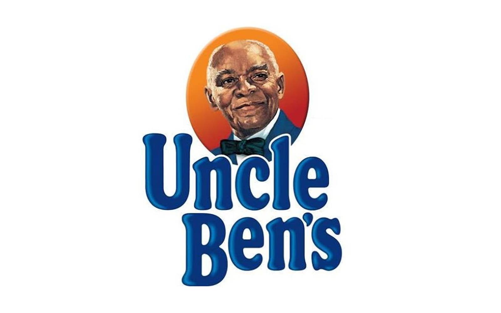
This version already looks pretty much like the current one.
Here, Uncle Ben is wearing a jacket and a bow tie and is placed inside an orange circle paired with a dark blue banner. Also, you can see the name of the product in a plump and cozy serif type with prominent rounded serifs.
The dark blue of the wordmark echoes the color of the jacket.
2009
![]()
The designers slightly updated the typography without changing its overall style. The most notable modification can be seen in the letter “U,” where the difference in the width of the strokes grew smaller.
Uncle Ben’s head was now tilted in the opposite direction, and there was no banner.
2016
![]()
The character is holding his head straight, although the recognizable expression on his face has been preserved the same. Both the bow tie and the jacket have disappeared, so no he is wearing only a white shirt.
The color of the letters has grown darker. The light blue highlights have disappeared making the lettering flat.
Technically speaking, the red circle has been gone. And yet, as the Uncle Ben’s logo on the package is typically put on the orange background, the heritage “dark blue vs. orange” contrast is still present.
Racism criticism
![]()
To begin with, the name of the brand reflects the practice of white Southerners addressing elderly African-Americans as “uncle” and “aunt.” That was because the words “Mr.” and “Mrs.” were considered not suitable. Another popular brand using the same approach was Aunt Jemima.
Another part of the stereotype (which disappeared from the logo in 2016) was the bow tie, which reminded servants and Pullman porters.
![]()
Because of these controversial facts, the company did not use this image in ads after the civil rights movement took hold – the Uncle Ben’s logo was silent, it could only be seen on the packages.
Yet, in 2007, Masterfoods and its advertising agency, TBWA/Chiat/Day, decided to change their approach to the problem. They “promoted” Ben and made him a chairman of the board, an accomplished businessman with an opulent office and other signs of his status. The magazine ads contained the slogan “Ben knows best,” while the character himself had the chairman’s title affixed on a plaque.
On the brand’s site, you could have a virtual tour of his office, look through his e-mail messages or his executive memorandums.
On the downside, many experts interrogated by the New York Times criticized the character for not having a surname (something impossible for a person of that stature). Also, they noted that the transition from a servant to a chairman of the board looked too fast and unnatural.


