If someone who has never heard about Budget Rent a Car sees this logo, they will hardly guess what type of company it belongs. Interestingly, the logo does not even contain the full name of the company. And yet, the design works well, in this case as the brand is well-known.
Meaning and history
Budget was founded by Morris Mirkin in 1958 in Los Angeles. Initially the company’s fleet consisted of only 10 cars, and the main activity was to rent inexpensive cars for vacationers. A year later Julius Lederer joined the company, and together with Mirkin they took Budget to an international level. Over the years Budget Rent A Car grew and expanded steadily.
Today Budget is one of the leaders in car rental and a recognizable brand all over the world. Budget Car Rental is headquartered in Parsippany, New Jersey, USA. The company specializes in low-cost car rentals and has more than 3,400 rental stations in more than 125 countries.
What is Budget Rent a Car?
Budget Rent a Car is the name of an American car rental company, which was established in the end of the 1950s in California, and today operates globally, being owned by the Avis Budget Group. The company has almost four thousand offices worldwide.
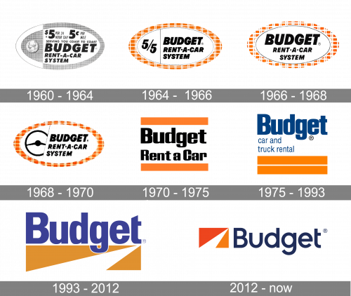
1960 – 1964
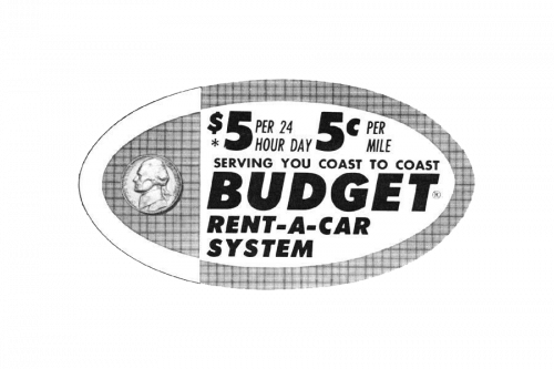
There was originally an oval with lots of text elements inside that they used for a logo. The prices and mileage were listed on the big right section, alongside a multilayered text bit saying ‘serving you coast to coast’, then ‘Budget Rent-A-Car System’ in bigger letters. The left section only contained an image of a penny.
1964 – 1966
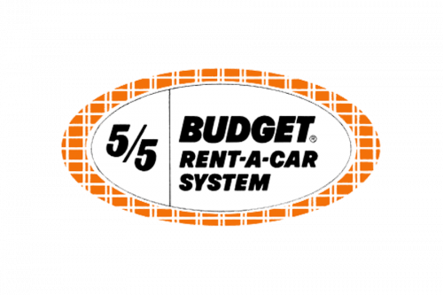
In this new version, they got rid of the mileage and pricing, as well as the bit about the coasts. The penny was replaced with the ‘5/5’ writing. Although the contents were black-and-white, the frame of the oval was an orange checkered pattern. They used a similar thing in the previous variation.
1966 – 1968
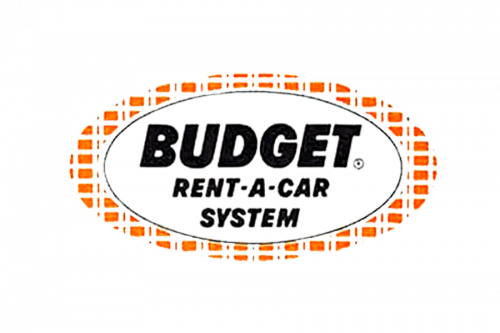
The 1966 evolution got rid of the left section completely, and the text was moved to the center of the figure.
1968 – 1970

A few years later, they divided logo into section again. The left bit now held a big black image of a steering wheel. Compared to the other designs, this divide was diagonal, and not strictly vertical.
1970 – 1975

The oval foundation was gotten rid of. Instead, they added two horizontal, orange lines above and below the main writing. The writing was just ‘Budget Rent A Car’ (exactly as written).
1975 – 1993

In this version, the two lines were stacked in the bottom. Above them, the authors wrote a brand-new wordmark: ‘Budget’ (in big letters) & ‘car and truck rental’ (in smaller letters). They used the color blue and the font was a soft sans-serif style.
1993 – 2012
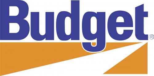
The 1993 design uses the same ‘Budget’ bit, but bigger and with lighter shade of blue. It’s put on top of an orange rectangle with a white ray of sorts going diagonally through it, which is a much simpler idea.
2012 – Today
The old Budget logo had the same structure as the current one. You could see the word “Budget” in blue over an emblem combining three triangles (two orange ones and a white one). The triangles formed an image that could be interpreted as a highway.
In 2012, the company updated its visual brand identity. The type grew lighter and sleeker. Both the orange triangles grew darker. While in the original logo, their color was identical, the updated logo featured two different shades.
In addition to the lock-up where the wordmark is above the emblem, there is also an alternative one where the road graphic comes to the left.
The updated Budget logo looks more like that of the parent company, Avis.
Font
Despite its seeming simplicity, the type looks fresh, dynamic, and unique. Among its distinctive features are the shortened horizontal bar on the “t” and the minimalist “u.”
Company overview
Budget Rent a Car System, Inc. was established in 1958. While originally, the US car rental company was based in Los Angeles, California, its operations are now headquartered in Parsippany, New Jersey. Back in 2010, the number of locations was around 2,750.
Font and Color
The clean and stable title case lettering from the official badge of Budget Rent a Car is set in a modern geometric sans-serif typeface with rounded contours of the characters and straight cuts of the lines. The closest fonts to the one, used in this insignia, are, probably, Ascent Pro Bold, or Yaro Rg Bold, with some modifications.
As for the color palette of the Budget visual identity, it’s composed of dark blue and two shades o orange, with pain white for a stronger contrast. Orange is a color of energy and dynamics, while blue represents stability and professionalism, creating a perfect graphical image for the company.


