Bruno Mars is the stage name of one of the world’s most popular pop singers and songwriters who were born in 1985 in Hawaii. His career started in 2004 and since that time Bruno Mars has released three albums and sold almost 150 million copies across the globe.
Meaning and history
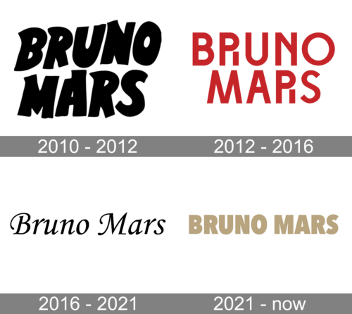
Bruno Mars is the musical synonym to youthfulness, energy, and modern style. So is his visual identity. It has only been changed once, but both versions brilliantly reflect the singer’s character and unique style, evoking a sense of drive, light, and movement.
There is nothing too complicated in the singer’s logo — just a wordmark, set in two levels, with “Bruno” above “Mars”, but the custom typefaces and intense solid colors create an atmosphere of professionalism, passion, and power.
2010 – 2012
The logo from 2010 was executed in a monochrome color palette with condensed black capital letters. The custom cartoonish typeface of the inscription is something in between Sour Crunch Regular and Lovely Scream Queens. The letters are placed slightly uneven, creating a sense of movement or a little wave.
Everything about Bruno Mars evokes a feeling of dynamics and energy, and even the black bold lettering, which could be just a boring logotype, was designed in a unique and recognizable manner, perfectly representing one of the world’s most famous singers.
2012 – 2016
The redesign of 2012 brought red color to the Bruno Mars visual identity, making it even more powerful and energetic. The style and typeface of the inscription were also dramatically changed and became more modern and distinct.
Now the logotype is executed in a clean and strong sans-serif font, which is very similar to Mono Spec Semi Bold, a contemporary typeface with shortened diagonal “N”-bar. The only difference is the letter “R”, which was modified in order to reflect the singer’s individuality.
The Mars “R” repeats the traditional contours of the sans-serif letter, but has its right vertical bar separated from the body, and drawn as a straight vertical line, which adds unique geometry to the whole image.
The Bruno Mars logotype is instantly recognizable. It has a powerful character and does need no additions. It is a balanced and perfectly designed inscription, reflecting all the best features of the singer and the music he does. Trendsetting, just as Bruno Mars himself.
2016 – 2021

The logo, created for Bruno Mars in 2016 was first used for his “24K Magic” album and is still used by the singer for advertising and promotional materials. The elegant and smooth logotype in monochrome is executed in a title-case of an italicized typeface, which is very close to Monotype Corsiva Std Regular, a timeless and sophisticated font, evoking a sense of fundamental approach and professionalism.
2021 – Today
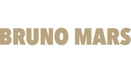
The redesign of 2021, has created a very stable and confident logo for Bruno Mars, writing his name in the uppercase of an extra-bold modern sans-serif typeface with straight cuts of the lines and clean, well-balanced contours. The main thing about this simple composition is the color — the wordmark is set in a smooth, brownish-gold shade, which evokes a sense of excellence, style, and luxury.


