 Brighton & Hove Albion Logo PNG
The football club Brighton & Hove Albion based in the city of Brighton and Hove, East Sussex, the UK, was established in 1901. It played in the Premier League for the first time in the 2017/18 season.
Meaning and history
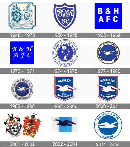
For most of its history, the Brighton & Hove Albion logo has been dominated by blue. Another recurrent motif has been a seagull, which has appeared on more than five versions of the logo. This fact can be explained by the team’s nickname, the Seagulls. It was adopted by 1977 and replaced the nickname the Dolphins. A seagull has been present on the Brighton & Hove Albion FC logo ever since, although it hasn’t looked the same.
1948 — 1970
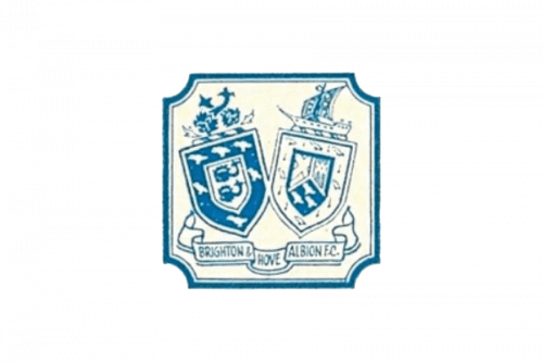
The very first official logo of the British football club was executed in a very elegant and traditional manner and featured the images of two crests, representing two cities, Brighton and Hove. The logo was executed in thin dark blue lines with all the elements set on a white background and outlined in a fancy blue frame.
1956 — 1958
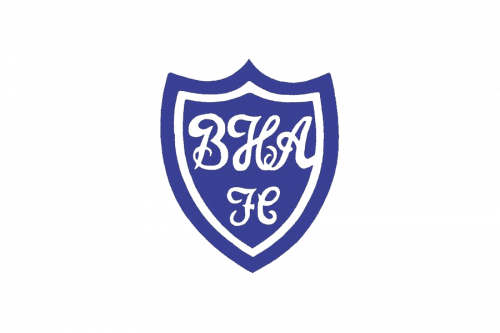
In 1956 another logo was created for the club — a solid blue crest with a sharp top part and a double outline, thick blue and thin white. The only element on the crest was a fancy white monogram, with the lines of its uppercase letters elongated and curved.
1968 — 1969
In 1968 the club decided to try a more modern approach to the logo design and introduced a super minimalist badge in a bright and memorable color palette. The bold white uppercase letters in a simple clean sans-serif typeface were placed in two levels on an electric-blue square. Nothing else, not even a frame or an image of a football.
1970 — 1971
The bold sans-serif inscription was changed into a handwritten cursive lettering for only one year in 1970. The color palette remained untouched, but due to the use of thin and elegant lines in the logotype, the whole badge looked softer and finer than the previous version.
1974 — 1975
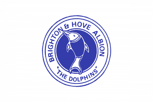
The first mascot image appeared on the football club’s visual identity. And, surprisingly, it was not a seagull, but a dolphin. The circular badge had its middle part solid blue, and the wide frame in white, with a double blue outline and a modest blue inscription written along with the frame in all capitals of a traditional sans/serif typeface. The blue and white stylized dolphin was placed vertically in the center of the badge. This version of the logo only stayed with the club for a few months.
1977 — 1980
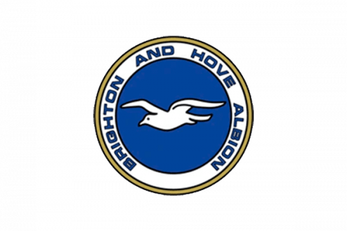
The first seagull badge was introduced in 1977. The color palette of the logo still featured blue and white, but now the circular badge gained a delicate golden outline. The lettering around the white frame of the emblem became wider and stronger, evoking a sense of progress and growth. As for the central part of the insignia, it now featured a smooth white image of a flying bird, facing left.
1980 — 1998
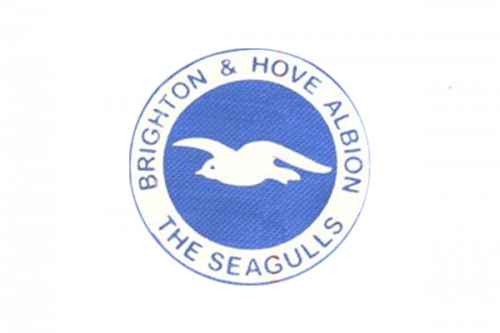
In 1980 the contours of all the elements on the badge were refined and the golden outline was removed from the logo. The white framing became wider, which made it possible to enlarge the size of the lettering, and now the inscription looked more professional and readable. As for the seagull, its contours have also been cleaned, but nothing changed much.
1998 — 2000
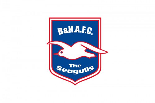
Another version of the logo for the British football club was created in 1998 and stayed for two more years. The white seagull got enlarged and outlined in red. The bird was now placed over a solid blue crest with a thick white and red framing and bold white lettering, set above and under the seagull. It was a simple yet bright and memorable emblem.
2000 — 2011
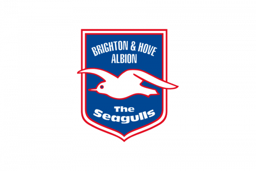
The contours of the crest were emboldened and cleaned in 2000. All the elements remained in their place, but the shortened “B&H AFC” was now replaced by the full “Brighton & Hove Albion” lettering in white capitals of a narrowed modern sans-serif typeface, which looked cool and professional.
2001 — 2002
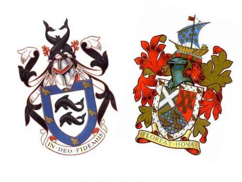
For just one year, in 2001, the team decided to come back to its original version of the logo — with two crests. But now both elements were redrawn, according to their real color palette, and with all the details. So the new insignia looked very ornate and intense, showing the value of the club’s roots, and their background.
2002 — 2004
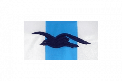
In 2002 after the ornate crests logo, the British club had been using a very minimalist badge, with an elegant black contour of the seagull set on a rectangular badge, separated into three segments — a bright blur in the middle, and two whites on the sides. No lettering or framing here.
2011 — Today
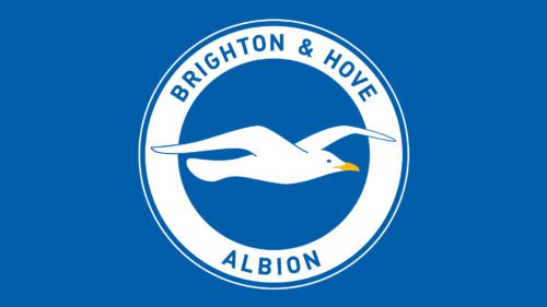
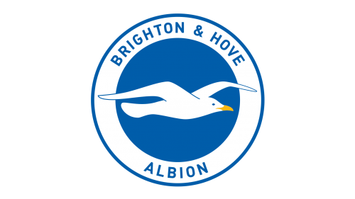
The redesign of 2011 brought back the circular badge from the 1989s, but all elements got redrawn and the seagull is now facing right, flying into the future and showing the willingness and ability of the club to grow, develop, win, and learn.
Colors
The current palette features a discreet shade of blue paired with yellow and white.
Brighton & Hove Albion Colors
BLUE
PANTONE: PMS 2935 C
HEX/HTML: #0057B8
RGB: (0, 87, 184)
CMYK: (100, 52, 0, 0)
YELLOW
PANTONE: PMS 116 C
HEX/HTML: #FFCD00
RGB: (255, 205, 0)
CMYK: (0, 14, 100, 0)


