 Boston University Terriers Logo PNG
Boston University Terriers are the athletic teams of Boston University, which was founded in 1839 as a seminary of the Methodist Church in Vermont, has gone through several transformations and moves, and is now one of Boston’s largest universities.
Meaning and history
Boston University is a private university founded in 1839. It is one of the largest independent non-profit universities in the United States. Its athletic program, Boston University Terriers, consists of 24 sports teams, which compete in the first Division of the National Collegiate Athletic Association.
Hockey Season is the athletic highlight of the academic year, because Boston University, unlike many others, does not field a soccer team. The university has won 30 of the 66 titles in the annual Beanpot men’s hockey tournament, in which its team competes against Harvard, Northeastern University, and chief rival Boston College. Boston University hockey players are recognized as some of the strongest in America.
All of the university’s teams compete in Division I: men’s ice hockey and basketball teams, and women’s softball, soccer, field hockey, rowing, and track and field teams. Of the variety of sports offered, the most popular is broomball, which is similar to ice hockey in sneakers with a ball instead of a puck and a broom instead of a stick.
What is Boston University Terriers?
Boston University Terriers is the name of an athletic program from Boston University. The program consists of 14 women’s and 10 men’s athletic teams, which compete in various sports disciplines, including Basketball, Ice Hockey, Cross Country, and many others.
The official Boston University mascot, the Boston Terrier, was first introduced in 1917. It was not chosen by chance. This breed of dog was bred in 1839, the year the university was founded. And until today, the image of this dog is an essential part of the Boston University Terriers logo.
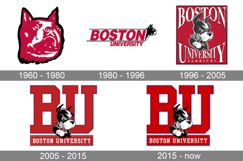
1960 – 1980
The Boston University Terrier logo, designed in 1960, looked a bit creepy. It was an image of a terrier’s head, executed in a dramatic red-and-white color palette with a thick black outline. The image was not accompanied by any lettering. This pretty weird logo stayed with the athletic program of Boston University for twenty years.
1980 – 1996
The redesign of 1980 has created a more modern and balanced logo for the Boston University Terriers teams. It was a slanted two-leveled lettering in red capitals, written in a geometric sans-serif typeface, with the black-and-white image of a terrier coming out of the badge in profile, facing to the right. The upper part of the inscription was enlarged and enclosed into a thin black frame.
1996 – 2005
In 1996 the Terriers logo was redesigned again, introducing a new style of the mascot’s drawing, which is still used by the teams today. The cartoonish terrier in gray and white was depicted in the middle of the composition with the vertically oriented rectangular red background. The name of the athletic program was written above and beyond the mascot in white shadowed serif characters.
2005 – 2015
Another redesign was held by the BUT in 2005, introducing a brighter and more geometric version of the Terriers’ logo. The Gray of the mascot was switched to black, making a more contrasting look of the whole badge. The image of the terrier was still in the center of the composition, but the background was completely different. The main part was taken by the geometric serif “BU” abbreviation in two shades of red, while the bottom of the logo featured a solid red banner with the white “Boston University” inscription on it.
2015 – Today
In 2015 the calm and deep shade of red on the Boston University Terriers logo was replaced by a vivid scarlet-red. Even though all other elements of the badge remained the same, due to the more intense shade of red the whole logo became fresher and more modern.
Font and color
The uppercase lettering from the Boston University Terriers primary logo is set in a geometric serif typeface, which looks pretty traditional for American colleges and their athletic programs. The Terriers’ font is quite similar to such commercial types as Yearbooktrade, Athletico Clean, or Undergrad.
As for the color palette of the Boston University Terriers visual identity, it is composed of scarlet red and white, the official colors of the BU athletic program, with an addition of black, used for the drawing of the mascot.


