Boomerang is a family entertainment television channel that began as a Cartoon Network programming block and became a separate channel in 2000. Boomerang airs animation classics including such cartoons as Scooby-Doo, Tom and Jerry, The Flintstones, and Garfield.
Meaning and history
Boomerang is a Cartoon Network cartoon channel. It specializes mainly in classic animated series. The channel began in 1992 as a program block on Cartoon Network, and after 8 years, separated, becoming an independent cable TV channel, broadcasting popular animated series, including The Pink Panther, The Flintstones, Tom and Jerry, and many others.
The channel is owned by Warner Bros. Discovery and is broadcast in more than 40 million homes across America. In 2017 Boomerang introduced its application for mobile devices.
What is Boomerang?
Boomerang is an entertainment channel of classic animation for kids and their parents with safe, quality content that has been bringing the whole family to the screen since 2000. “Tom & Jerry, Scooby Doo, Garfield, The Flintstones, The Pink Panther, and Bugs Bunny are enjoyed by kids and adults alike.
In terms of visual identity, the Boomerang channel has been pretty stable, with just one major redesign of its logo by 2023. The channel uses a laconic color palette, which balances the heavy and playful contours of the logo’s elements.
2000 – 2015
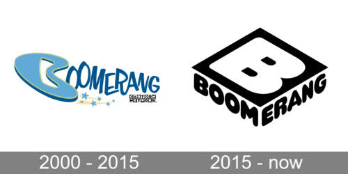
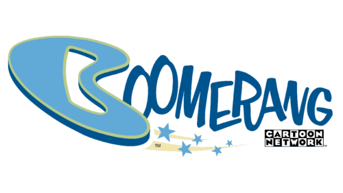
The original Boomerang logo, designed in 2000, has stayed with the TV channel for fifteen years. It was a bright blue badge with stylized lettering and the first “B” drawn in a shape of a boomerang, with a blue body and a light green outline. The inscription was accompanied by a delicate graphical emblem with five blue stars and two pale yellow strokes. In the bottom right corner of the logo, there was a black-and-white Cartoon Network insignia.
2015 – Today
The redesign of 2015 has completely changed the logo of the Boomerang channel. The badge started looking very modern and bold, set in a monochromatic color palette, with the enlarged white “B” set on a solid black square and accompanied by a black uppercase lettering in a heavy-rounded sans-serif typeface. No additional elements were added to the logo, as it already looked very strong and confident.
Font and color
The massive uppercase lettering from the primary Boomerang logo is set in a modern rounded sans-serif typeface, which is Teaspoon. The closest commercial analog to this font is, probably, Chunky Nouveau JNL Oblique, but with significant modifications of the contours.
As for the color palette of the Boomerang visual identity, it is based on the timeless classic combination of black and white, which is pretty logical, as all the content of the cable channel is bright, juicy, and intense, and the monochromatic badge looks readable and powerful on any of the backgrounds.


