BNSF Railway, an amalgamation of nearly 400 different railroads, stands as a colossal freight railroad network in North America. It was birthed merger of Burlington Northern Inc. and Santa Fe Pacific Corporation, engineered by visionaries aiming to forge a dominant transport route. Created to streamline and enhance freight transportation across vast distances, BNSF operates in the U.S., bridging key commercial hubs and facilitating trade with an efficient, reliable rail service.
Meaning and history
BNSF Railway’s tapestry weaves through American history, starting from a 1995 merger that united Burlington Northern and Santa Fe Pacific, echoing the ambitions of 19th-century rail pioneers. This fusion melded a legacy of tracks stretching back to the Civil War era, evolving from disparate railroads into a modern freight colossus.
With roots in exploration and economic expansion, BNSF grew into a pivotal artery of U.S. commerce, navigating through technological revolutions and market shifts. Its network, a lifeline spanning the continent, underpins the flow of goods, symbolizing progress and connectivity.
BNSF’s journey mirrors the American spirit of innovation and perseverance, driving forward, rail by rail, into the future.
What is BNSF?
BNSF Railway emerges as a pivotal backbone in North America’s logistic landscape, born from the strategic union of historic rail lines. It stands as a testament to innovation in freight movement, weaving a network that fuels commerce and connects communities across a vast continent.
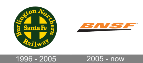
1996 – 2005
The logo is a vibrant meld of shapes and hues, featuring a bold circular emblem. Within, a cross divides the space into quadrants, each alternating between a dark backdrop and the emblem’s primary hue. The railway’s name arches around the circle’s perimeter in uppercase letters, punctuated by two stars, encapsulating the graphic. It’s a striking combination of tradition and simplicity, radiating a sense of steadfastness and connectivity.
2005 – Today
This logo is a modern distillation, featuring stark, bold letters spelling ‘BNSF’ in a striking orange hue. A sleek black underline adds dynamic contrast, suggesting motion and progress. The design embodies minimalism and forward-thinking, a nod to the railway’s continuous evolution.


