Blue Origin is the name of the aerospace company, which was founded in the United States in 2000 by Jeff Bezos, the CEO of Amazon. The main activities of the company include the provision of suborbital space tourism services and the delivery of cargoes to Virgin Orbit. Blue Origin also develops reusable rockets to deliver cargo and people into space.
Meaning and history
The space company Blue Origin was founded by Jeff Bezos in 2000, and for the first three years, no one knew anything about this startup. The project did not attract attention until 2003 when Bezos began actively buying up large tracts of land in Texas.
The company tested its first development in 2005. It was Charon, a modular platform for vertical takeoff and landing using a jet engine. A year later, the startup tested the Goddard suborbital spacecraft. From these developments came the suborbital spacecraft New Shepard, which the team Blue Origin has been developing for four years, and presented in 2010.
In 2021 Blue Origin began sending civilian crews into space on its New Shepard spacecraft. Jeff Bezos himself, his brother Mark, former pilot Wally Funk, and 18-year-old Oliver Damen, the company’s first commercial customer, whose ticket was given to him by his father Jos Damen, founder of Somerset Capital Partners, participated in the first flight.
Today Blue Origin has working shuttles and launch vehicles, as well as prototypes yet to be built and tested, and rocket engines. Among them are New Shepard, one of the company’s first projects. It is a reusable spacecraft, which is a manned capsule with a capacity of up to 6 people. It flies only in suborbital space. New Glenn, is even a heavier reusable launch vehicle that uses one of the company’s specially designed engines. There are plans to use the shuttle to carry satellites and people into orbit, but launches have been delayed for several years. And the Blue Moon, a rocket to fly to the moon that the company developed for one of NASA’s latest space programs.
What is Blue Origin?
Blue Origin is a space company established by Amazon founder Jeff Bezos in 2000. The company’s first developments began in 2005, and its first test rocket launches did not take place until 2015. Today the company successfully sends civilian crews to space.
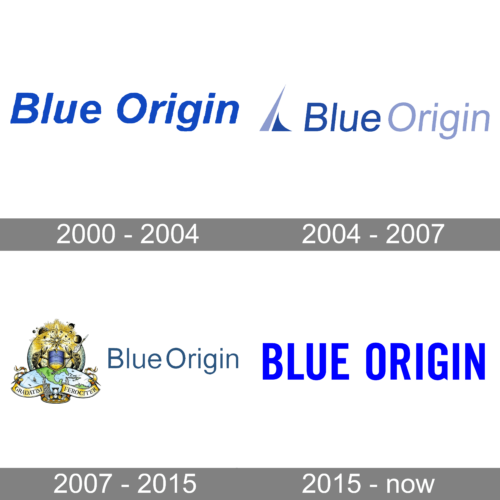
As for the visual identity, the logo of the aerospace company has undergone two major redesigns, which show the stages of the company’s progress and growth, yet all have one thing in common — blue color.
2000 – 2004

Although it was a very expensive startup, the company did not bother with its promotion or creating an exclusive logo. A deep blue was used to print the “Blue Origin” label. The letters were italicized and without serifs. An uneven edge of the stroke, though, gave it a unique touch. It created an association with a blue sky and curly clouds as well as flowing water. There were no other elements.
2004 – 2007
The initial Blue Origin logo was introduced in 2004 and featured a modern geometric composition with a sharp abstract emblem followed by a smooth and elegant logotype. The emblem represented a stylized rocket, composed of two parts in two shades of blue — the tall and sharp one in a light hue, and the short and curved in a dark one. As for the lettering, it was also set in the same two shades: the darker for “Blue”, and the lighter for “Origin”.
2007 – 2015
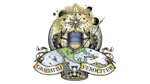
The redesign of 2007 has released a completely different badge for the space company of Jeff Bezos. It was a combination of an ornate old-style emblem with lots of elements and details and a modern minimalistic logotype in a calm shade of blue. The emblem features an image of a solar system, and two turtles standing on half of the globe, decorated by ribbons with the company’s motto. The Latin “Gradatim Ferociter” is translated as “Step by Step, Ferociously”. This “step by step” can also be seen in the image of two turtles on the logo. The company’s mascot represents Bezos’ principle “Slow is smooth, and smooth is fast”.
2015 – Today
In 2015 the Blue Origin logo get redesigned in a more progressive and modern way. The new concept is built on a solid sans-serif logotype and an emblem depicting a blue feather. On some of the versions the feather can be seen in black, and on others, only the lettering part is used. Both elements of the logo are set in a bright shade of blue, which makes the badge eye-catching and memorable.
Font and color
The Blue Origin logotype is set in a very confident and stable sans-serif typeface with heavy capital letters slightly narrowed. The font looks pretty similar to many modern types, with clean lines, strict contours, and straight cuts of the bars. The closest font to the one used in the Blue Origin logo is, probably, Veneer Clean Reg, or its “brother” Veneer Clean Soft.
As for the color palette of the Blue Origin visual identity, it is all blue. The bright and intense shade looks vivid and represents energy, along with the standard meanings of Blue, such as reliability, safety, and professionalism.


