

![]() NASA Logo PNG
NASA Logo PNG
In most cases, NASA uses one of its three main logos. The most popular ones are the so-called meatball and seal designs, but the “worm” logo is also used under certain circumstances. In addition to this, NASA may develop new emblems for certain projects.
Who designed the NASA logo?
The official seal was developed by a NASA Lewis Research Center illustrator. The so-called “meatball” insignia was designed on its basis by James Modarelli, the head of Reports Division at Lewis Research Center. The authors of the “worm” logo (1975-1992) were Richard Danne and Bruce Blackburn.

Meaning and history
![]()
One of the most reputable and influential organizations in the world, NASA, hasn’t had many logo redesigns during its history, but the two that are still in use by the Administration are very well known across the globe and both have funny nicknames — “Meatball” and “Worm”.
Though there was one more logo, not that famous. It was a visual identity for the National Advisory Committee for Aeronautics, or NACA, the predecessor of the NASA, formed in 1915.
NASA was founded on July 29, 1958, following the National Aeronautics and Space Act signed by President Dwight D. Eisenhower, marking the birth of a new agency dedicated to peaceful space exploration and the advancement of aeronautical science. This foundation laid the groundwork for an era of discovery and innovation that would challenge the unknown boundaries of space and benefit humanity in countless ways.
Over the decades, NASA’s main achievements have captivated the world’s imagination. The Apollo moon landing in 1969, the launching of the Hubble Space Telescope in 1990, and the Mars Rover landings are just a few milestones in its history of space exploration. These endeavors have not only expanded our understanding of the universe but also led to significant advancements in technology, science, and engineering that have had widespread applications on Earth.
Currently, NASA continues to be at the forefront of exploring the cosmos. With missions to Mars, the study of Earth’s climate, and the development of new aerospace technologies, NASA remains a global leader in uncovering the secrets of the universe. Its commitment to exploration, research, and discovery ensures that the agency will continue to inspire and lead in the quest to explore the vast unknown for the benefit of all humanity.
What is NASA?
NASA, the National Aeronautics and Space Administration, is a United States government agency that leads the nation’s civilian space program and conducts aeronautics and aerospace research. With missions ranging from exploring distant planets to studying Earth’s climate, NASA’s efforts in space exploration and scientific discovery aim to benefit humanity and expand our understanding of the universe.
1915 – 1958
![]()
The logo of NACA featured a stylized badge with wings, colored in yellow with the black outline. The wordmark, executed in black was placed in the central part of the emblem and written in a simple yet stylish sans-serif typeface.
It was a well-balanced and professionally executed badge, which brilliantly reflected the nature of the organization and its purposes.
1959 – 1975
![]()
NASA was born in 1958, and its logo — one year after, in 1959. It was developed by one of the Administration’s employees, James Modarelli, and instantly got its “Meatball” tag. The logo, which was used until 1975 and brought back in 1992, is composed of a blue circle, representing the sky, with white stars, and a red V-shaped line or ribbon, which was aimed to represent the aeronautics in general.
The wordmark in bold serif lettering is colored white and placed in the center of the circle, with a thin white orbit around it.
This emblem also became a base for the NASA seal, which is only used for special events. It is a circular blue badge with a wide white frame and yellow outline. The red “National Aeronautics And Space Administration USA” title is placed around the frame’s perimeter. The yellow of the outline is balanced by the yellow placed, placed on a blue background inside the circle. The red V ribbon and a white orbit are placed around the planet.
1975 – 1992
![]()
The “Worm” insignia was designed for NASA in 1975 and then was replaced by the circular emblem in 1992, but brought back as a secondary badge in 2020. It is a logotype, where capital letters are executed in a custom smooth sans-serif typeface, featuring rounded angles and distinct cuts. Both “A” of the inscription have their horizontal bars removed.
The smooth contour of the inscription resembles a worm in motion, this is where the funny nickname came from.
1992 – Today
![]()
Meatball is the official NASA logo since 1992. And it’s not only the most long-lasting badge of the National Aeronautics and Space Administration, but also the most popular one, and can be seen on various goods starting with t-shirts and finishing with keychains all over the globe.
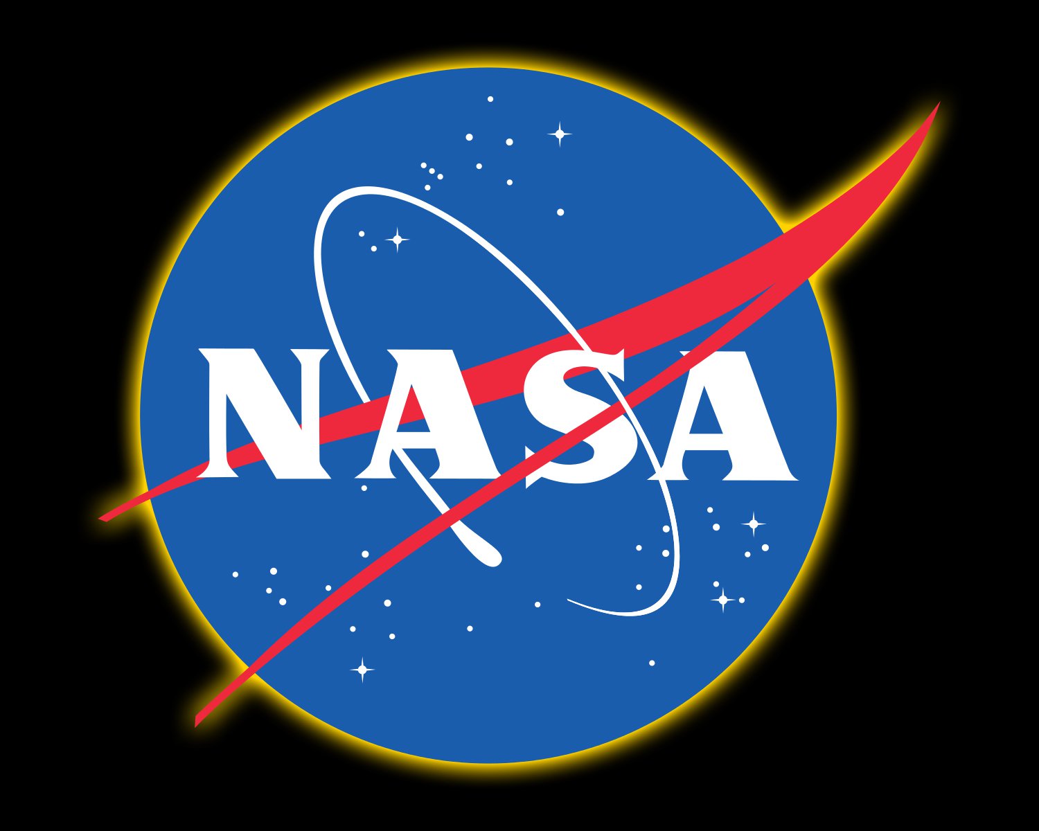
On the Meatball logo, the NASA name is shown in white capital letters on a round solid blue background, with red strokes in the shape of a horizontally oriented “V” next to it. The red symbol also looks like a stylized bird flying upright with its wings gently curving at its ends. The composition is complemented by a very thin white orbit.
2020 – Today
![]()
The NASA Worm insignia was used from the 1970s until 1992, and then came back in 2020, but is being used along with the iconic Meatball. This minimalistic and extremely stylish logo with bold red letters on a plain background looks modern and powerful, perfectly complementing the classic elements and lines of the second badge.
The Worm can also be seen on various clothing and souvenir items, but is less popular than the Meatball one, as has fewer elements. The bold smooth letters are red by default, but their color can change depending on the color of the clothing.
The “seal” symbol
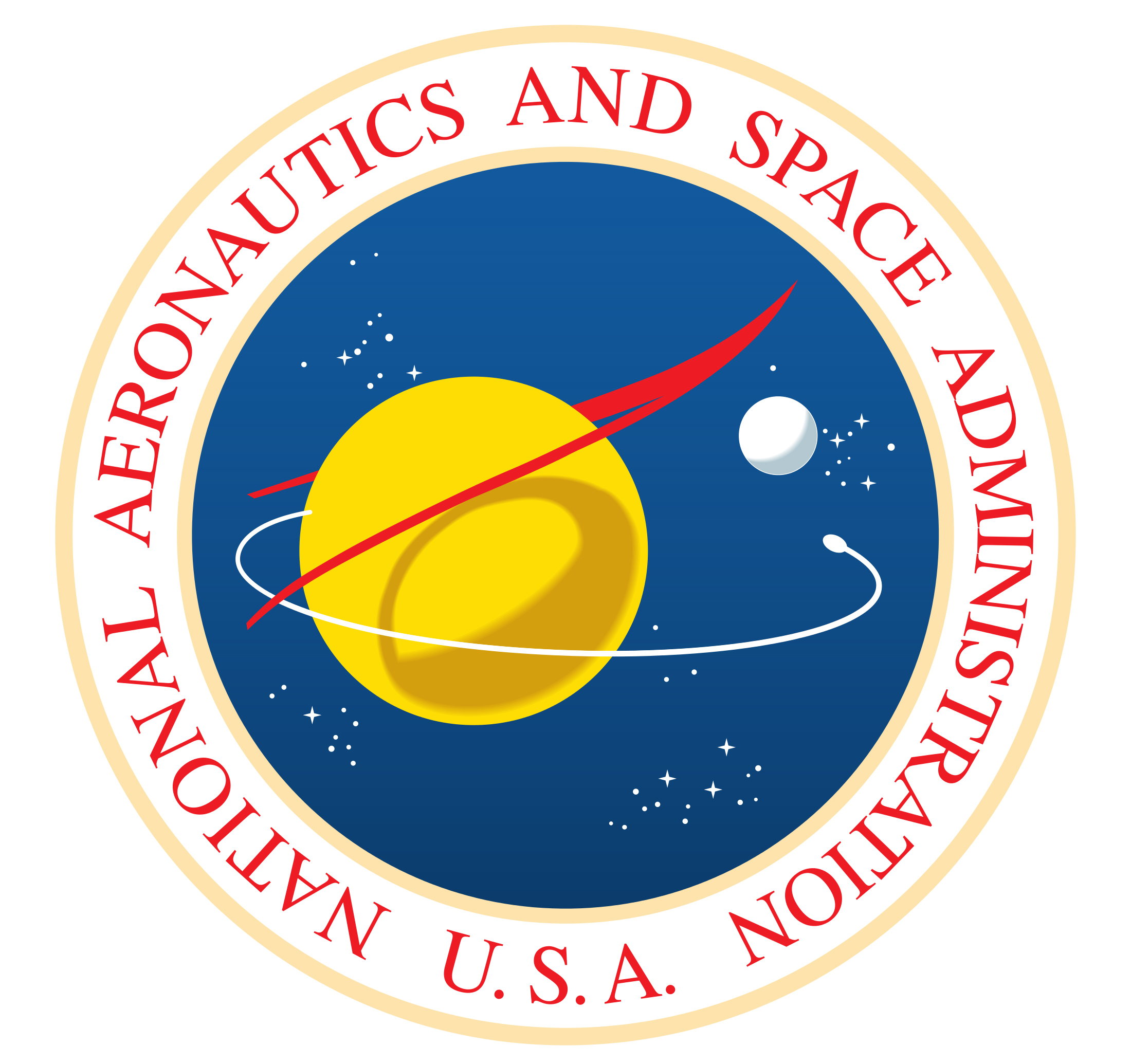
When NASA holds or takes part in award presentations and ceremonies, the company uses a special “dressed-up” version of its official emblem. This symbol is called “seal”. In addition to the stars, orbital path, and vector elements that can be seen at the regular NASA logo, the “seal” also includes two planets and “The National Aeronautics and Space Administration U.S.A.” inscription.
![]()
The “worm” emblem
![]()
In 1975, designers Richard Danne and Bruce Blackburn, as part of the Federal Design Improvement Program, developed a new emblem for the space organization, famously known as NASA. This initiative aimed not just at enhancing the aesthetics of federal agencies’ visual identities but also at underlining the essence of their missions—in NASA’s case, the benefit of humanity through space exploration. The redesign led to the creation of the “NASA worm,” a logotype where all lines forming the word “NASA” had consistent width. The distinctive feature was the absence of crossbars in the “A” characters, making the custom type resemble a worm. This emblem, rich in its simplicity and forward-looking vibe, was adopted as a crucial part of NASA’s communications material, reflecting the agency’s commitment to exploring different planets and the unknown realms of space. The “worm logo” became an iconic representation of NASA’s brand for 17 years, until the organization decided to revert to its original “meatball” insignia, signaling a return to its roots while retaining a legacy of innovation and adherence to the guidelines of the Federal Graphics Improvement Program.
Font
The transition back to the “meatball” NASA logo did not just signify a return to tradition but also an evolution in how NASA’s identity was communicated to the world. This emblem features a bold serif type, with each character capitalized, showcasing the agency’s authority and legacy in the field of space travel. The custom typeface, reminiscent yet distinct from known fonts like Queskile Voyage Medium and Fiducia Serif, boasts heavy and stable letters. This design choice was not arbitrary but was guided by the need to strike the right balance between readability and uniqueness, ensuring that the NASA logotype could be easily identified in advertising, media, and merchandising applications without compromising copyright restrictions.
What font is on the NASA logo?
The lettering from the NASA “Meatball” logo, designed in 1959, is executed in a bold serif typeface, which is very close to such fonts as Bambi and Qeskile Voyage Medium. As for the “Worm” logo, it is written in a custom Sans-serif, which looks close to such modern designer fonts as Space Std Bold and Nasalization Bold.
Color
![]()
The “meatball” insignia uses three colors: a bright hue of red (Pantone 185), dark blue somewhat reminiscent of the evening sky (Pantone 286), and white.
Why is the NASA logo called the worm?
One of the NASA logos is nicknamed “The Worm” for its custom unique style of lettering. The logo was created in 1974 by the design firm Danne & Blackburn. The word “NASA” written in red was immediately nicknamed “the worm” because of its unique lettering. The letters “N” and “S” symbolized rocket tubes, and the “A” without a line in the middle indicated rocket nose fairings.
Did NASA change its logo?
NASA has changed the logo only twice in its history. The agency’s first logo, which it still uses today, was the “meatball”. It was designed by agency employee James Modarelli in 1959, the second year of NASA’s existence. In 1975 the agency decided to switch to something more modern, and in 1975 the “worm” became the official logo of the agency. Today both logos are used by NASA.
Can you use the NASA logo?
NASA gets no interest from the use of the logo by other brands. And this is very important. NASA stylistics is a so-called public domain, you do not have to pay for the commercial use of its elements. This explains the fact that a large number of brands produce their collections in this style.Companies nevertheless need permission to use the logo.
What is the official NASA logo?
NASA now has two official logos, the famous “meatball” and the “worm”. For a long time, the blue ball, “meatball,” was the official logo, but in 2017 the agency decided to license the “worm” and allow its use, at least in brand marketing.


