The Air Canada logo has gone through at least seven updates.
Meaning and history
The history of the company dates back to 1937, but then it was called Trans-Canada Airlines. In 1949, the company’s management changed its location from Winnipeg to Montreal, and in 1964 the name was changed to the modern Air Canada. The company was state-owned until the late 1980s, when it became privately owned only years later. In 1984, the company was the first airline in North America to offer its passengers the Aeroplan loyalty program. And in 1997, it was among the companies that founded the international airline community Star Alliance.
With the advent of the 2000s, Air Canada bought into its own ownership another Canadian carrier, Canadian Airlines, increasing its fleet so much that it was ranked as the 12th largest airline in the world.
What is Air Canada?
Air Canada is the name of the Canada’s largest national carrier, founded in 1937 as Trans-Canada Airlines, or TCA. Today the airlines have its flights in more than 160 directions across the globe. Air Canada’s most popular destinations are in North and South America, Europe, and some destinations in Asia.
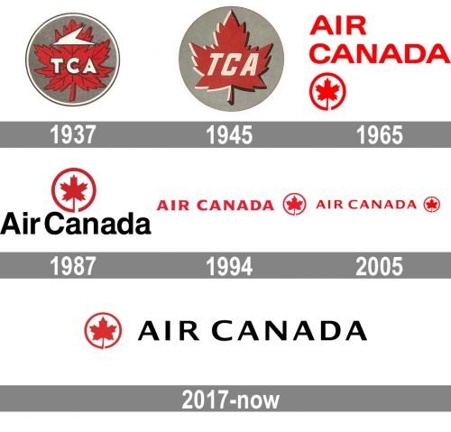
1937
The original name (Trans-Canada Air Lines) was reflected in the earliest emblem. You could see it in the form of the abbreviation “TCA” placed over a red maple leaf. There was a stylized paper plane above.
1945
The plane disappeared from the Air Canada logo leaving only the lettering “TCA” over the maple leaf. There was also a version with the lettering “Air Canada” below.
1965
Here, the words “Air Canada” dominate the design. The type features distinctive “A’s” with rounded tops. The maple leaf is now placed inside a circle with the red border. The shade of red has grown brighter.
1987
The leaf (which is now slightly less bright) has been placed above the lettering “Air Canada,” which is given in black.
1994
Once again, the company name goes red. The sans serif type has been replaced by an elegant serif font. The shape of the leaf has been slightly modified – it looks softer than in the previous version.
2005 – present
The serifs have been removed, while the type has grown somewhat lighter. The overall style has remained virtually unchanged, though.
2017 – present
In addition to the all-red version, the company added a logo where the wordmark is black.
Font and color
The solid and elegant Air Canada logotype in all capitals is executed in a bold sans-serif typeface with clean lines and wide shapes of the letters. The typeface of the inscription is very similar to such modern fonts as Sweet Gothic Medium and Indecise Expanded Medium.
The black color of the inscription is complemented by a red and white emblem, celebrating the symbol of the country, the maple leaf, and the color palette of its national flag. The black red and white palette is a timeless and sophisticated representation of power and confidence, along with the patriotism and professionalism of the company.


