Blogger is an online platform, which helps users to publish and history their blogs. The service was developed in 1999. Today the company is a part of Google and is one of the world’s most popular blogging platforms.
Meaning and history
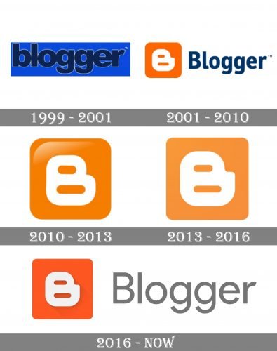
The Blogger logo has had many redesigns throughout the online service’s history, which started in 1999. Though the color palette which the company uses today was introduced with the second logo version, in 2001, as well as the icon itself, the service kept trying to find a perfect shape and execution, which finally happened in 2016.
1999 — 2001
The very first Blogger logo was created in 1999 but didn’t stay long with the website, it was more a trial version, composed of a dark blue logotype in an outlines traditional sans-serif with massive shapes and thick lines, written in the lowercase. The wordmark was placed on a blue background, and there was no strong contrast between the two shades of blue, so sometimes the logotype was placed on a white background for better visibility.
2001 — 2010
The redesign of 2001 brought a new symbol, which is still in use by the service today, just with some modifications. It was a rounded orange square with a white stylized letter “B” on it. The icon was placed on the left from the dark blue wordmark in the title case. The lettering featured a narrowed modern sans-serif with clean lines and traditional letter-cuts.
2010 — 2013
In 2010 the wordmark was removed from the main version of the Blogger visual identity, and the icon became the only element of it. It was redrawn in a glossy and three-dimensional manner, adding some gradients to the upper part of the orange square. The contours and lines of the emblem were cleaned and refined.
2013 — 2016
In 2013 the service decides to start drawing its emblem flat again, so all the gradients were gone, and the logo, adopted in 2013 was composed of a plain orange square with softened angles and an iconic white “B”, with a unique angle between its upper and bottom parts.
2016 — Today
The changes of 2016 include the wordmark and a new color palette. The orange of the emblem became more intense, closer to coral-red, while the “B” remained untouched and still uses white as its color.
As for the logotype, it is written in a title case on the right from the icon and uses simple shadows and a strict gray color.
Font and color
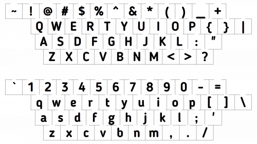
The Blogger wordmark, written in a simple and light sans-serif typeface, which is very similar to Pulp Display Light, looks laconic and professional, showing the boring and routine part of the service and pointing to its expertise and reliability.
The orange, white and gray color palette of the Blogger visual identity is a combination of solidness and confidence with creativity, joy, and loyalty, the qualities, which the service values most, and tends to give them all to their users.


