The Chicago Blackhawks logo has gone through quite a few amendments since its introduction in 1927. However, its visual core remained essentially the same, so in fact it has been more of a transformation of one and the same emblem rather than a succession of different emblems.
Meaning and history
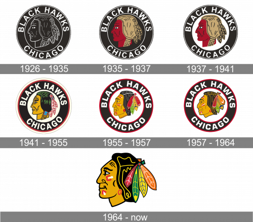
The visual identity of the hockey club from Illinois has always been pretty constant in terms of geometric shapes and symbols, though the color palette of its circular badge was being switched from redesign to redesign, so throughout the years, there were six different versions of the shades and tones. The only emblem, different from the others is the one, introduced by the team in the middle of the 1960s and still in use by the Chicago Blackhawks.
What are Blackhawks?
Chicago Blackhawks is the name of a professional hockey club from the United States, which was established in 1926, and today competes in the National Hockey League as a member of the Western Conference. The club has United Center in Chicago, Illinois, as its home arena and Derek King as the head coach.
1926 – 1935
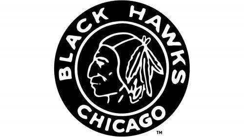
The original circular badge of Chicago Blackhawks was introduced in 1926 and featured a Native American man profile, turned to the left, drawn in thin white lines on a black background, and enclosed into a wide double frame with the bold capitalized inscription around its perimeter. The wordmark was visually split into two parts with the “Black Hawks” arched on top, and “Chicago” along the bottom side of the frame. Both parts of the inscription were executed in a traditional and clean sans-serif typeface.
1935 – 1937
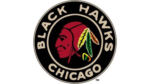
The redesign of 1935 switched the color palette of the team’s logo from monochrome to black, white, burgundy, and beige, where the last two shades were used for coloring the Native American man from the badge,
1937 – 1941
The background of the inner circle was switched from black to white, making the whole badge look airier and fresher, though it still stayed powerful and masculine, keeping all the other elements untouched.
1941 – 1955
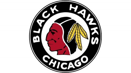
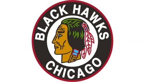
The redesign of 1941 brought new colors and contours to the Black Hawks’ visual identity, outlining the circular badge in white and red and redrawing the Indian man in yellow, green, and black, with white and red feathers in his hair. The lettering on the badge’s frame became bolder and more condensed, which made it look brighter and stronger on a black background.
1955 – 1957
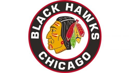
In 1955 the logo was redrawn again, by refining the contours of the man, making his profile more realistic and detailed, and adding more feathers to his hair. The feathers were now cold sore red, green, and yellow, and the face of the Native American man had some red and yellow ornaments. As for the inscription, it has changed its typeface to a more modern geometric one, though the color palette of the framing remained untouched, besides the white outline, which was removed on this version.
1957 – 1964
The contours of the Indian’s profile were refined again, and one of the red feathers got changed to an orange one, the lines of the portrait became wider and shorter, which added more balance to the circular logo, distributing the brier negative space in a more harmonized way. The wordmark remained untouched, as well as the color palette of the other elements on the logo.
1964 – Today
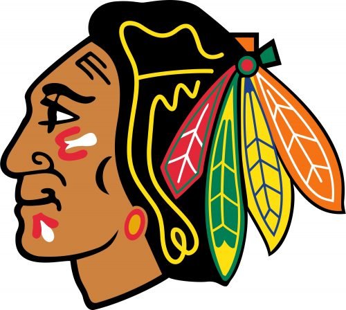
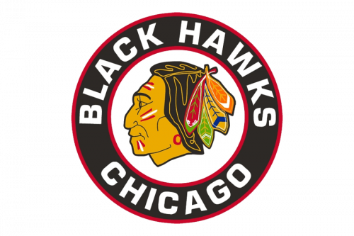
The redesign of 1965 brought to Chicago Blackhawks the version of the logo we all can see today. It is the same Native American man, looking to the left, but on this version, he is drawn without any flaking or lettering around. As for the colors of the visual identity, the palette is slightly elevated and uses bright shades along beside and black ones. The red, green, yellow, and orange feathers in the Indian hair make the whole image vivid and dynamic.
Font
The logo does not include a wordmark, so any fitting typeface may be used to spell the name of the team.
Colors
From the point of view of the color scheme, the current Chicago Blackhawks logo is rather rich. The war paint on the face of the Indian is red, black, and white, while the feathers feature red, green, blue, white, yellow, and orange. We should also mention the golden color of the Indian’s face, as well as his dark brown (or even black) hair. The team’s official colors are red, black, and white.
RED
PANTONE: PMS 186 C
HEX COLOR: #CF0A2C;
RGB: (207,10,44)
CMYK: (2,100,85,6)
ORANGE
PANTONE: PMS 165 C
HEX COLOR: #FF671B;
RGB: (255,103,27)
HSB: (19,89,100)
CMYK: (0,74,98,0)
GREEN
PANTONE: PMS 348 C
HEX COLOR: #00833E;
RGB: (0,131,62)
CMYK: (96,02,100,12)
YELLOW
PANTONE: 109 C
HEX COLOR: #FFD100;
RGB: (255,209,0)
CMYK: (0,9,100,0)
TAN
PANTONE: PMS 131 C
HEX COLOR: #D18A00;
RGB: (209,138,0)
HSB: (39,100,81)
CMYK: (17,49,100,2)
BLUE
PANTONE: PMS 2747
HEX COLOR: #001970;
RGB: (0,25,112)
HSB: (225,100,43)
CMYK: (100,96,24,21)
BLACK
HEX COLOR: #000000;
RGB: (0,0,0)
HSB: (225,100,0)
CMYK: (75,68,67,90)
WHITE
HEX COLOR: #FFFFFF;
RGB: (255,255,255)
HSB: (225,0,100)
CMYK: (0,0,0,0)


