BlaBlaCar is an online service, created in 2006 for people willing to travel together by car, sharing the costs. Established in France, today the website and application are widely used all over Europe and is constantly expanding to new countries and continents.
Meaning and history
The online service, helping people across Europe to find fellow travelers, boasts a simple yet recognizable visual identity, which was created in 2018. For the first five years of the company’s existence, it used even a more minimalist logo, which was nothing special, and didn’t stay in people’s memory.
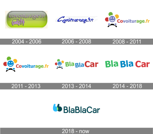
2004 – 2006
The original logo for the service was created in 2004 and stayed unchanged for the first two years of the company’s history. It was a lime-green three-dimensional plate with gray gradients, an image of a car with two people standing near it, and a lowercase “Covoiturage Fr” name of the website, set in a slightly italicized classy typeface, with all characters set in glossy gray, which made them voluminous and elegant.
2006 – 2008
In 2006 the logo of the travel service was simplified to just the lettering, set on a plain white background, and accompanied by thin horizontal lines, which were barely visible because of the light shade of gray, they were colored in. The inscription was set in the title case of a custom rounded sans-serif font, where the “C” was slanted to the right, the “O” was falling, and all other letters inclined to the left.
2008 – 2011
The redesign of 2008 has introduced the completely new Covoiturage badge, with the bold sans-serif lettering set on the right from the bright and funny emblem. The graphical part comprised a stylized flower with two circles of its hands placed on a steering wheel. Both elements of the badge were set in a color palette, composed of red, purple, green, and yellow, and the arch line, standing for the wheel in the emblem was painted black.
2011 – 2013
The Covoiturage color palette was refined in 2011, with all shades brightened up, and the smooth purple replaced by the intense medium-dark blue. As for the overall concept, it remained untouched, but the smiling face of the flower started looking even friendlier, due to the stronger contrast of the colors now. It was the last badge for the company, named Covoiturage, as in 2013 it gets renamed BlaBlaCar.
2013 – 2014
The first BlaBlaCar badge was created in 2013, adopting the emblem from the last Covoiturage badge, but rewriting the lettering. The new inscription was set in a heavy sans-serif font with all “BlaBla” characters inclined to the left, and the “Car” enlarged and placed straight along the line. The logotype had its three parts set in three colors: Green, Blue, and Red.
2014 – 2018
The BlaBlaCar logo introduced in 2013 was composed of a wordmark, visually split into three parts. The two first “Bla” and “Bla” featured green and blue colors respec-tively and were placed slightly diagonally, looking like they are going to take off and fly now. The third, “Car”, part of the inscription was colored fuchsia pink and placed straight lay on the horizontal line. The whole insignia was executed in a traditional and bold sans-serif typeface with no extra details or unique elements.
2018 – Today
The redesign of 218 changed the BlaBlaCar style and made it more confident and contemporary. Now the wordmark is set in one line with no spaces between three parts. The inscription in clean and accurate sans-sharif is executed in a drop green color which represents wellbeing, success, and growth. On the left of the logotype, there is a graphical part of the visual identity, its emblem.
The BlaBlaCar emblem is composed of two overlapping letters “B” in the liver case. They look like two commas, representing the quote sign. The “B”s are executed in blue and green, with a small like-green accent on the place of the overlap.
This delicate and ironic emblem shows the main purpose of the online service — to find something to chat while traveling, to make “Bla-Bla”.
The BlaBlaCar logo is very delicate and modest, yet its interesting color palette and memorable emblem make the service stand out and point on the professionalism and friendliness of the platform.


