

![]() Birmingham Stallions Logo PNG
Birmingham Stallions Logo PNG
The Birmingham Stallions were originally a franchise in the United States Football League. In the modern incarnation of the USFL, the Birmingham Stallions have continued to demonstrate competitiveness, finishing strong in their seasons and appealing to a passionate local fan base. They got the USFL championships in 2022 and 2023. The Birmingham Stallions have contributed to the sports culture in Alabama and have been significant in the history of football in the region.
Meaning and History
![]()
Birmingham Stallions were initially established in 1982 as part of the United States Football League (USFL) and played until the league’s collapse in 1985. The Stallions were one of the most successful teams in the USFL, winning the championship in 1984 and 1985 and drawing a loyal fan base during their brief existence. Following the shutdown of the USFL, the Stallions were dormant for many years until they were revived in 2022 as one of the eight teams in the relaunched USFL, which is now operating as a spring league.
What is Birmingham Stallions?
The Birmingham Stallions are a professional American football team. Their history and revival highlight the ongoing interest in spring football leagues and the opportunity for cities like Birmingham to support professional football.
1983 – 1985
![]()
The team’s colors are burgundy, golden, and white. The team’s mascot is an anthropomorphic stallion, reflecting the team’s name and branding. The stallion is typically done in golden and pictured running. It has “Birmingham” arching in the back and “Stallions” printed in larger font in a straight line under its feet. The designer used a bold red color with a confident serif font. The whole logo has a strong and impressive look that the team has proved to be well worth multiple times even in its early years.
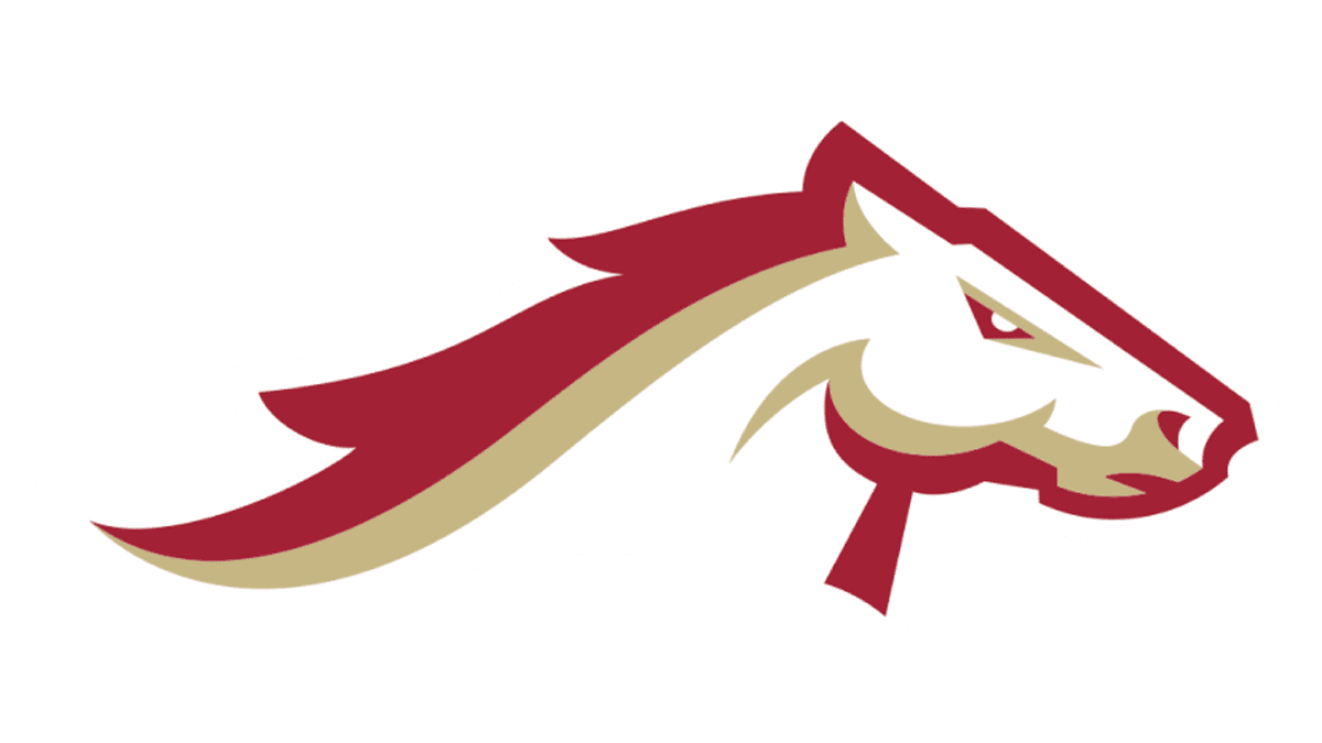
2022 – Today
![]()
With a new stage in the history of the team, the fans saw an updated logo. It features almost the same color palette with the exception that a burgundy shade of red replaced a lighter red color. It now has only a stallion with a mane that shows it is running. The expression shows that the animal is concentrated and strong-willed. The stallion is still pictured above the name. The latter is printed in two straight lines one above the other. Just like the original, it features a significantly larger and bolder font for the “Stallion” part. The logo turned out to be very balanced, dynamic, and daring.
Font and Color
The original logo features a bracketed slab serif font with bold strokes that is supposed to reflect the strength of the team. The logo introduced in 2022 uses a modified version of Heist Italic by Nyalaapi for the “Stallions” part of the name. Two other similar fonts include Behover College Slanted by Martype Co. and Spacelord Two font. The location is printed using a font similar to Sweet Square Bold Italic Small Caps by Sweet or Superscience Black Expanded Italic font.
Red/burgundy, white, and golden are the colors used in both logos. The red color gives the logo a powerful, striking, and eye-catching appearance. It also stands for the passion of each team for the game and success. Meanwhile, the golden adds a luxurious touch, noting that only the best players make up the team. It is also synonymous with power in many cultures. The white sets a neutral background and creates a nice contrast with the red.


