Big Idea Entertainment is a renowned name in the entertainment industry, primarily known for its animation productions. Founded by Phil Vischer and Mike Nawrocki in 1989, the company rose to prominence with its faith-based series, “VeggieTales.” Originating in the United States, Big Idea quickly expanded its influence, distributing its content in various regions across the globe. Its core vision is not just to entertain, but to provide moral and spiritual lessons to children through its engaging animated stories. The company continues to develop content that resonates with both kids and parents alike.
Meaning and history
Phil Vischer and Mike Nawrocki established Big Idea Entertainment back in 1989. Their unique approach to animation, intertwining faith-based messages with humor and engaging storylines, set them apart in the industry. Their flagship series, “VeggieTales,” became a household name, earning accolades and achieving massive sales in home video markets. Over the years, Big Idea produced various other series and ventured into feature films, maintaining its commitment to delivering wholesome content. Big Idea Entertainment remains a significant player in the animated content realm, with a legacy of positively impacting young viewers worldwide.
What is Big Idea?
Big Idea Entertainment is a production company renowned for its animated content, most notably the “VeggieTales” series. Founded in 1989 by Phil Vischer and Mike Nawrocki, the company has been instrumental in delivering faith-based, morally enriching entertainment for children. With a blend of humor, captivating storytelling, and ethical lessons, Big Idea holds a unique place in the hearts of many families globally.
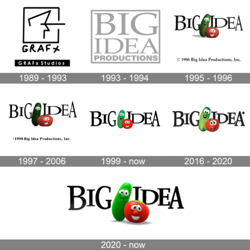
1989 – 1993
An artistic embodiment of minimalist design, the GRAFx Studios logo features a stylized, abstract rendition of the letter ‘A’ within a square, suggesting a canvas or a screen. The interconnected lines offer a sense of unity and continuity. Below this emblem, the brand name “GRAFx” is presented in a contemporary, bold typeface, echoing the edginess and modernity of the design world.
1993 – 1994
The logo is defined by its boldness and simplicity. “BIG IDEA” is written in block letters, exuding confidence and grandeur. The words are precisely stacked, emphasizing stability and structure. Beneath, “PRODUCTIONS” is typeset in a more subtle font, offering a foundation to the logo’s primary message. The grayscale color palette gives it a classic, timeless feel.
1995 – 1996
A playful iteration of the brand, this logo integrates two vibrant characters: a lively green cucumber and a cheerful red tomato. Their animated expressions convey creativity and fun. The characters rest beside the bold “BIG IDEA” text, juxtaposing the firmness of the brand with its ability to think outside the box. The year at the bottom adds a touch of authenticity and history.
1997 – 2006
Similar to its predecessor, this logo highlights the animated duo but with subtle differences in character positioning. The cucumber stands tall, while the tomato, with its wide-eyed wonder, leans in. The “BIG IDEA” text remains dominant. The inclusion of “1998” at the bottom not only signifies the logo’s vintage but also stamps the brand’s enduring legacy in the entertainment world.
1999 – now
Embodying a playful essence, the Big Idea logo integrates a vivid green cucumber and a radiant red tomato as its central figures. Both animated characters exude joy and whimsy with their wide, expressive eyes and cheerful smiles. Positioned adjacent to the bold “BIG IDEA” text, the design juxtaposes a formal typeface with the lightheartedness of its cartoon mascots, striking a balance between professional and fun.
2016 – 2020
A spirited rendition of the brand, this version of the Big Idea logo employs the familiar duo of the smiling cucumber and tomato. However, what sets it apart is the presence of the registered trademark symbol, emphasizing the brand’s established presence and authenticity. The characters seamlessly meld with the dominant “BIG IDEA” text, showcasing the brand’s commitment to creativity and innovation.
2020 – Today
A closer look at the iconic Big Idea design reveals a more pronounced focus on the cucumber and tomato characters. Their endearing expressions and vivid colors pop against the stark backdrop. The “BIG IDEA” text, presented in an assertive typeface, frames the characters, hinting at the brand’s capability to think big while maintaining a light-hearted approach.


