BHP is an Australian Gad and oil corporation, which was established in 2001 through the merger of Broken Hill Propietary and Billiton. The company also specializes in mining and iron ore.
Meaning and history
BHP is an Australian multinational corporation, the world’s largest in the mining industry. The head office is located in Melbourne, Australia, as well as in London. The company has had a long history, with the predecessor of the current business, BHP Billiton, formed through a merger of the Billiton company and the Broken Hill Proprietary Company.
Billiton was founded in September 1860. Initially, it was engaged in smelting tin and lead in the Netherlands. By the forties of the twentieth century, the company began mining bauxite in Indonesia and Suriname. Later in 1970, it was acquired by Shell. Between 1994 and 1997 Billiton was owned by South Africa’s Gencor Ltd.
Broken Hill Proprietary Companywas established in 1885 and specialized in silver and copper mining in Australia. In 1915, the company began producing aluminum. By 1960, BHP began to produce oil.
In 2001, the two companies merged to form BHP Billiton. In 2015, the company was renamed BHP.
What is BHP?
BHP is an Anglo-Australian company founded in 1885 and today has grown into the world’s largest coal exporter. BHP mines and produces iron ore, coal, nickel, copper uranium, gold, aluminum, and diamonds.
Before 1985
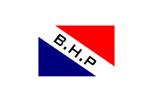
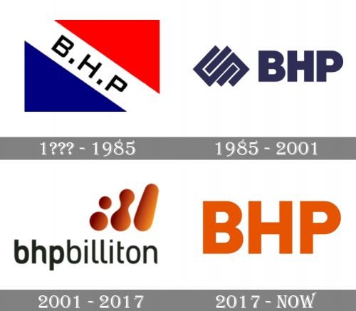
The original BHP logo featured a tricolor rectangular flag, with blue and red parts separated by a thick white diagonal banner with black lettering on it. It was a very simple composition, yet executed very professional and evoking a sense of power and stability.
1985 – 2001
The redesign did 1985 Brough a more minimalist and strict image to the company and now the BHP wordmark was set in the uppercase of a massive a modern sans-serif typeface in dark blue, and placed on the right from a geometric emblem with several overlapping squares and rectangles, resembling a chain-like structure.
2001 – 2017
In 2001 after the merger with Billiton, the logo was redesigned again, and the lettering, which was now set in the lowercase, got extended to “Bhpbilliton”. The graphical part of the redesigned identity was placed above the right part of the inscription and boasted three parts I’m drawn in gradient orange — two dots merged dots and a solid elongated drop. Symbolizing the growth of the new company.
2017 – Today
The BHP visual identity is laconic and minimalist. Based on the simple letterforms and just one bright color it looks professional and powerful.
The sans serif typeface of all the capital letters has thick straight lines and traditional cut angles. The nameplate is perfectly balanced and the letters are refined and look strong and neat.
The bright orange color of the BHP visual identity was inherited from the previous version of the company’s logo when it had the name BHPBilliton. The old logo was composed of all the lowercase wordmark with a meaningful abstract emblem.
Orange is a symbol of energy and passion, it evokes a sense of happiness and friendliness, reflecting the progressive and innovative company which also values the creative approach in everything.
The BHP logo’s simplicity makes it stand out. It is a timeless perfectly executed nameplate and the right choice of the color scheme. The logo represents an influential and super confident brand, which is looking into the future with curiosity and courage.
Font and Color
The heavy and stable lettering from the primary badge of BHP is set in an extra-bold geometric sans-serif font with clean contours and straight cuts of the lines. The closest fonts to the one, used in this insignia, are, probably, Halenoir And spandex Black, or Aceh Extra Bold.
As for the color palette of the BHP visual identity, it is based on a deep shade of orange, which symbolized energy and looks very optimistic and eye-catching. This palette makes the company stand out in the list orbits competitors, and shows it as a modern and progressive one.


