BetterMe, founded in 2016 by CEO Victoria Repa, is a wellness ecosystem that tailors health solutions to individual needs. With a philosophy centered around promoting a healthy and active lifestyle, it shuns extreme weight loss ideals, instead focusing on inner well-being. From just 3 team members, BetterMe has grown significantly and is now available in over 190 countries, offering its services in 10 languages. It has amassed over 100 million app installs, becoming a top downloaded Health & Fitness app and a leading behavioral healthcare app publisher.
Meaning and history
The company launched its first app, BetterMe Weight Loss Assistant, in May 2017, followed by the BetterMe app in August 2017. The app quickly achieved popularity, becoming the most downloaded health and fitness app in the US by February 2018. The same year, BetterMe expanded its app portfolio with the launch of BetterMen.
By 2018, BetterMe apps had over 20 million downloads and consistently ranked on the Most Downloaded Health & Fitness Apps list. By 2019, it was recognized as the world’s largest Health & Fitness publisher in terms of installs. In 2020, BetterMe introduced a web version, further solidifying its position in the digital wellness space. As of 2021, the company boasted over 100 million downloads and was available in 190 countries, maintaining a significant presence as a leading behavioral healthcare app publisher without changing ownership or deviating from its founding mission.
2017 – 2023
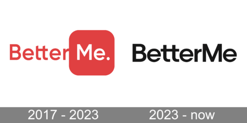
The logo displayed is for “BetterMe,” featuring a minimalist and contemporary design. The brand name is split into two parts with “Better” in bold black font and “Me” in a softer red, placed inside a pink rounded square. The period after “Me” adds a touch of finality, symbolizing completion and the attainment of personal goals. The contrasting colors and typography reflect a balance between strength and gentleness, aligning with the company’s focus on personal wellness and self-improvement.
2023 – Today
The redesign of 2023 has simplified the BetterMe logo, rewriting the name of the brand in plain black lines against a white background. The typeface of the inscription was also changed to a more laconic and modest one, and the two parts of the inscription were placed closer to each other.
Font and color
The medium-weight title case lettering from the primary logo of BetterMe is set in a clean geometric sans-serif typeface, with some custom elements, such as merged horizontal bars of the “T”s. The font, used in this insignia, is somewhat in between YD Yoonche and Widy, with some modifications.
As for the color palette of the BetterMe visual identity, it is as simple as possible — black and white, the combination, which stands for professionalism, reliability, and excellence of services.


