BET is the name of a famous tv-channel, which was established in 1980 in the USA. The cable channel specializes in African-American content, and the abbreviation BET stands for Black Entertainment Television. The network is a part of the Viacom Media Corporation. BET has a quite impressive audience of more than 90 million households in the country.
Meaning and history
Black Entertainment TV, founded by John Malone, started broadcasting on January 25, 1980, and for three years it was a two-hour daily block. In 1983, BET evolved into a full-fledged television network with content consisting of music videos and classic Afro-sitcoms. Five years later, its own news service was launched. Since 2000, the channel’s original programs, including sitcoms, began to appear. The first multi-part drama produced by BET, “Being Mary Jane”, was released in 2013.
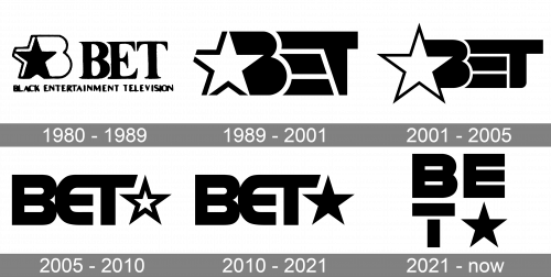
The visual identity of the cable channel was changing with the progress and the growth of the BET popularity, and there were several major redesigns of the monochrome logo throughout the years.
1980 – 1989
The very first logo for BET was designed by Cheryl D. Miller in 1980 and stayed with the network for a bit more than eight years. It was an elegant yet bold and recognizable badge with the serif logotype set on the right from the delicate emblem-signifier and underlined by a full channel’s name tagline. The emblem featured a stylized outlined letter “B” with a bold black five-pointed star embedded in its left part. As for the text on the logo, it was executed in a thick-lined and slightly narrowed font with too gated and sophisticated serifs on the lends of the bars.
1989 – 2001
The redesign of 1989 made the black-and-white BET logo modern and progressive, keeping the star element and removing the full name of the channel from the badge. Now the star was executed in white and outlined in black, placed on the left part of a stylized extra-bold black lettering in a custom designer font with massive letters and elements.
2001 – 2005
In 2001 the contours of the BET logo were refined, keeping the original idea and color palette. The white star was enlarged and the letters got straightened, with the lines getting a bit more elegant than on the previous version. The horizontal bar of the “T” was elongated even more to the left, and with the straightening of the letters, it became more visible. The logotype also got its corners rounded and softened.
2005 – 2010
The redesign of 2005 was held by two bureaus, Push Creative and UVPH. It was still about the inscription and a star, but the elements switched their places and styles. The logotype was now executed in a smooth modern sans-serif typeface, which is very close to Handel Gothic, with the lines modified, and the white star in a thick black outline was placed on the right from the wordmark.
2010 – 2021
The contours of the inscription and the graphical symbol remained untouched after the redesign of 2010, but the white star turned black, and this changed all the mood and style of the badge. The whole logo started looking more solid and stable, evoking a sense of style and power, with a touch of professionalism and confidence, along with a progressive approach and fashion.
2021 – Today
In 2021 the BET logo was redesigned again, and this time Sibling Rivalry Studio is the responsible bureau. The logo changed its shape to a square, splitting the inscription with the emblem into two levels, with the white “BE” in bold sans-serif placed above a bold stencil “T” with a solid white five-pointed star in the same size. The new concept looks simple yet strong and clean, with sharp contours.
Font and color
The typeface of the BET logo was designed by Sibling Rivalry Studio in 2021, based on the classic geometric sans-serif typeface, with straight lines, clean angles, and distinct bar cuts. The minimalistic contours of the letters add confidence and a bit of brutality to the badge.
The timeless and powerful black-and-white color palette has always been with the BET logo, since its first days. And this choice is pretty logical for the African-American content TV channel.


