While the logo of the holding company Berkshire Hathaway may look too simple, it is probably a perfect emblem for this type of company – it means business and nothing but business.
Meaning and history
The history of the Berkshire Hathaway Inc. can be traced to a textile manufacturing company founded in 1839. Today, the chairman and chief executive is Warren Buffett. In 2017, Berkshire Hathaway was mentioned on the Forbes Global 2000 list as the world’s third-largest public company.
Symbol
The Berkshire Hathaway logo features the name of the company in dark blue. The overall look of the wordmark is very traditional. The very choice of the font, Times New Roman, speaks for itself. Very few companies can afford to be that generic. Also, there’s not a single drawing or emblem, just the lettering. In other words, there’s only work and no play.
Taking into consideration the type of business the Berkshire Hathaway is into, the logo of this type looks close to perfect. The retro font, the neutral colors create a sense of reliability and common sense. The fact that there’re no images may also emphasize that the company isn’t willing to spare money.
HomeServices emblem
The Berkshire Hathaway HomeServices is a national real estate franchise launched by Twin Cities-based HomeServices of America and Brookfield Asset Management in 2014. It was the first time that Berkshire Hathaway’s Warren Buffett agreed to share his brand with a real estate company.
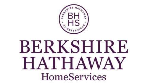
The centerpiece of the logo is a roundel emblem comprising capital letters “BHHS” encircled by the company name. Below, there’s also the name of the company in larger letters. The text and the circle are white, while the background is purple.
The official brand guidelines for BHHS mention two approved brand colors, cabernet (a version of purple based on PMS 7659 C) and cream (based on PMS 9143 C).
Font
As we’ve already mentioned above, the font featured on the Berkshire Hathaway logo is nothing but Times New Roman Bold, a version of one of the most widely used typefaces. It is a transitional serif type developed by Stanley Morison, an influential British typographer, and Victor Lardent, a British advertising designer and draftsman at The Times newspaper. The font was published by the type foundry Monotype.
Colors
The dark blue chosen for the emblem is just another way of emphasizing the company’s core values – reliability, common sense, traditionalism.


