The ice hockey club Belleville Senators is the top minor league affiliate of the professional club the Ottawa Senators
Meaning and history
The Belleville Senators, an ice hockey team in the American Hockey League (AHL), were founded by the Ottawa Senators in 2017. This establishment marked a strategic move to create a development team for the National Hockey League (NHL) franchise. Since their inception, the Belleville Senators have played a crucial role in nurturing talent for the Ottawa Senators, with many players graduating to the NHL level.
Throughout their history, the Belleville Senators have achieved significant milestones. They are known for their competitive spirit and have made notable appearances in the AHL playoffs. These achievements underscore the team’s commitment to excellence and development. Players who have honed their skills with Belleville often go on to make substantial contributions in the NHL, highlighting the team’s role in player development and its impact on the sport at the highest level.
Currently, the Belleville Senators continue to play a pivotal role in the development of hockey talent. They maintain a strong presence in the AHL, both in terms of competitive gameplay and as a key contributor to the sport’s growth. Their ongoing efforts to nurture and develop players keep them at the forefront of the hockey world, contributing significantly to the sport and the community.
What is Belleville Senators?
The Belleville Senators are a professional ice hockey team in the American Hockey League, serving as the primary development team for the Ottawa Senators of the NHL.
1972
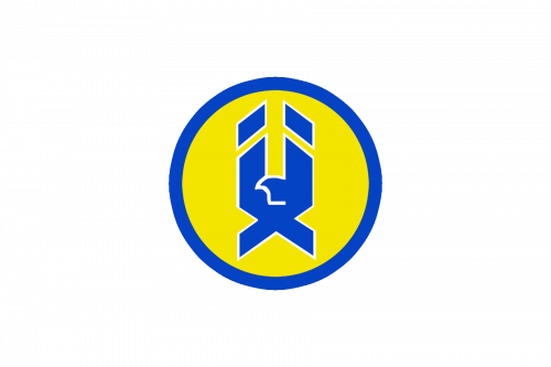
As the original name of Belleville Senators was Hawks, the first emblem featured a sharp geometric image of a bird, drawn in a Chevron style with its wings up, in bright blue and white, and placed on a solid yellow circle in a blue outline. It was a bright and strong emblem with a good color contrast, which made the composition memorable and eye-catching. No wordmark was written on the badge.
1977
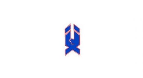
The circle was removed from the Hawks logo in 1977. As for the main element, its contours remained untouched, but the color palette got switched to bright blue and shiny copper for the outline. This new shade added sharpness and strength to the emblem. Blue was standing for freedom and speed, as well as the bird itself, while its geometric contour and sharp angles evoked a sense of professionalism and determination.
1988

The redesign of 1988 kept the stylish recognizable badge, but switched its color palette to two shades of silver — the light one for the body of the bird, and the darker shade, with glossy gradients, for the outline of the elements. Another important thing was added to the badge — the wordmark. It was executed in bold uppercase letters of a stable and solid sans-serif typeface with straight lines and massive shapes. The inscription was written in black and placed diagonally over the hawk, starting at the bottom left corner and moving upright.
1992
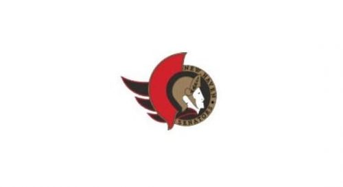
The name of the club was changed to New Haven Senators in 1992, and the new logo was introduced in the same year. It was a completely new circular badge in black, red, and dark gold, with the profile of a legionary in a gold helmet placed on a solid black background with a gold circular framing, where the black lettering was set around its perimeter. The only bright detail — red — was set on the right of the helmet, being its continuation.
1994
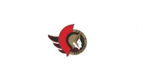
In 1994 the club’s name was changed again, and the lettering became the only thing changed in the Senators’ badge. All the other elements, including the color palette and the legionary portrait, remained untouched. This new logo stayed with the club for almost eight years, reflecting strength, professionalism, and willingness to fight.
2002
The old logo featured a cartoonish character, which was a combination of a hockey player (as he was holding a hockey stick) and a Roman general (the helmet).
2017 — Today
The 2017 logo has nothing to do with the emblem that the team used during its years in Binghamton. The new Belleville Senators logo is clean and straightforward. A large letter “B” is depicted over a black and red flag. The “B” stands out due to a thin white outline.
Colors
The color scheme is based on the combination of red and black with white as a secondary color used to emphasize the contrast.
RED
PANTONE: 186 C
HEX COLOR: #C52032;
RGB: (197 32 50)
CMYK: (16 100 87 5)
GOLD
PANTONE: 1245 C
HEX COLOR: #C2912C;
RGB: (194 145 44)
CMYK: (24 42 100 3)
BLACK
PANTONE: BLACK C
HEX COLOR: #000000;
RGB: (0,0,0)
HSB: (350,89,0)
CMYK: (75,68,67,90)
WHITE
HEX COLOR: #FFFFFF;
RGB: (255,255,255)
HSB: (42,0,100)
CMYK: (0,0,0,0)


