Battlefield is a video-game, which was created by EA DICE in 2002. This first shooter is considered to be one of the world’s most successful team video games, as it has over 50 million copies sold across the globe.
Meaning and history

The Battlefield game’s visual identity is based on a strong and distinct logotype. The logo is modern and minimalist, showing the masculine and confident character of the game and its nature.
The Battlefield nameplate in all capitals is executed in a strict sans-serif typeface, which is very similar to Sheldrake JNL. It has clean and neat lines and straight angles and edges of the letters.
The monochrome color palette of the Battlefield logo allows placing it on any back-ground without losing its power. The simplicity of the letterforms and color combina-tion elevate the logo, making it elegant and timeless.
The visual identities of Battlefield 2-6 editions are based on the original version, just the contouring and color palette varies. Some logotypes are made three-dimensional, others have a thin or thick outline. The numbers of the chapters are written with Arabic letters until the fourth edition, starting with the fifth — the company uses the Roman numbers.
What is Battlefield?
Battlefield is the name of a video game, designed by the EA DICE studio at the beginning of the 2000s. The game, which sold more than 50 million copies, is based on a World War I scenario. Battlefield is a multiplayer shooter, which also offers an individual-player mode.
2002 – Today
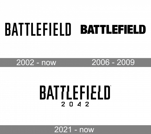
The original Battlefield logo, designed for the game in 2002, is still used by the franchise today. The badge features ablack uppercase inscription in a narrowed sans-serif typeface, with the capital letters of the wordmark set against a white background with a slight distance between each other.
2006 – 2009
In 2006 another version of the Battlefield badge was introduced. And even though it was also black lettering on a white background, it looked completely different from the original version, due to the use of a new typeface — a heavy geometric sans-serif with thick lines and straight cuts of the bars.
2021 – Today
The badge, created for the Battlefield game in 2021 is based on the original logo of the franchise, designed in 2002. The five letters of the narrowed sans-serif inscription got slightly modified, with the bottom parts of the bars a bit shifted to the left, which creates a cool deformation, making up a unique image, full of motion and energy.
Font and color
The narrowed distinctive lettering from the primary Battlefield badge is set in the uppercase of a geometric sans-serif typeface. The closest fonts to the one, used in this insignia, are, probably, Big Noodle Titling, or Size Semi Bold, with some insignificant modifications.
As for the color palette of the Battlefield visual identity, it is based on a classic timeless combination of black and white, which looks brutal, powerful, and progressive.


