Omation Animation Studios was founded in 2002 as the animation division of O Entertainment, which was established by Steve Oedekerk. It debuted with the feature film Barnyard.
Meaning and history
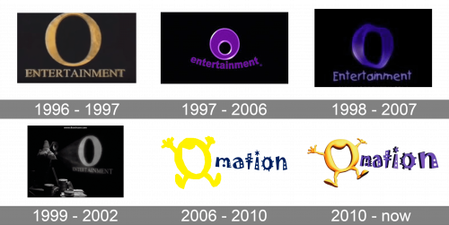
Despite all the modifications the Omation logo, as well as the logo of its parent company, has gone through, it has always preserved one characteristic feature – a prominent glyph “O.”
1997 (first version)
To better understand the visual brand identity of Omation Animation Studios, we should look at the logo of its parent company, O Entertainment.
To begin with, you can take a look at the short-lived version with a perfectly “serious” (and generic) “O” dominating the word “entertainment” in capital letters with serifs.
1997 (second version)
The films Jimmy Neutron: Boy Genius and Barnyard feature a more playful modification. The “O” gets a more unusual shape, while the word “entertainment” is now set in the lowercase letters. The violet, the gradient, and the golden highlights add a 3D effect.
1998
The design team goes on experimenting with the “O.” Its shape is now distorted as if you look at it through the water. The same can be said about the second word, too. The type is now lighter and has more breathing space.
1999
At the beginning of the Thumbs! series, excluding Thumb Wars, you can see a version of the first 1997 logo.
2007
Here is where the real history of the Omation logo starts.
Once again, there is a prominent “O” having an unusual shape. The bright yellow letter represents a mouth open wide (as if it is crying “O-o-h-h”). The mouth has hands and legs.
The writing “mation” features a highly creative type with multiple details, spots, thorns, etc.
2010 – now
The final episodes of Back at the Barnyard and Planet Sheen showcase a 3D version. Here, the “O” adopts gradient, shades, and highlights, due to which it resembles baked goods. The shape of all the elements of the logo has been slightly tweaked.


