CoinDesk is the name of the world’s most reputable online platform of news and information about cryptocurrencies. The media portal was created in 2013 by Shakil Khan, and today is widened by the Digital Currency Group (DCG). The service has also been publishing its bitcoin index since the year of its foundation, which is one of the most well-known benchmarks in the cryptocurrency market.
Meaning and history
CoinDesk is the blockchain industry’s leading media company, which was founded in the United States in 2013. Today it is one of the most influential and trusted platforms, providing millions of crypto traders and blockchainers with up-to-date information, podcasts, research reports, and news.
What is CoinDesk?
CoinDesk is the world’s leading web-portal of cryptocurrency news and information. The platform provides the latest news, current value, convenient features, and analysis of trends, technologies, changes, and companies in the world of digital currency. It was founded in New York in 2013, and today is owned by DCG.
As for the visual identity of the famous cryptocurrency news portal, it is bright and intense, progressive and powerful, and also graphically represents the essence of the platform.
???? — 2021

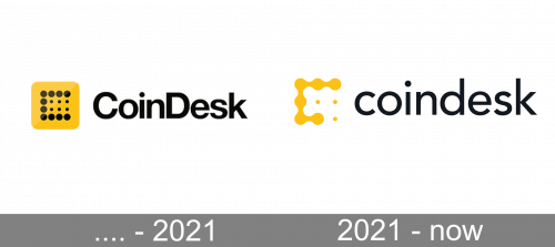
The first CoinDesk logo was composed of two parts: the emblem, which was also the web icon of the portal, and the logotype, which was usually set on its right. The emblem featured a solid yellow square with rounded angles, and a stylized letter “C”, formed by several solid black dots, and with six smaller dots set in its negative space. As for the lettering, it was written in the title case, with “C” and “D” capitalized, in a bold sans-serif typeface with classic shapes and traditional cuts of the lines.
2021 — Today
The redesign of 2021 kept the original idea of the CoinDesk logo, but made it stronger and more progressive, adding a futuristic and innovative touch to the simple yellow and black badge. The “C” formed by dots now has them connected with thick smooth lines, and the six dots from the negative space got replaced by only three smalls. The emblem is now set directly over the white background, with no additional colored square or framing.
The wordmark part of the logo was also rethought, and now the “CoinDesk” lettering is set in the lowercase and executed in a more modern and lightweight sans-serif typeface.


