Bradesco is the name of one of the largest banks in Brazil, which was established in 1943 and by today has more than 5 thousand operating offices across the country. The bank, headquartered in São Paulo, has a yearly revenue of more than 70 billion USD.
Meaning and history
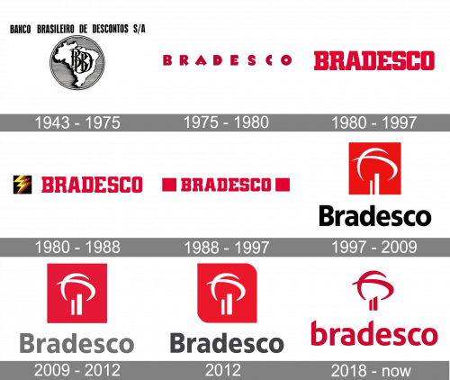
The visual identity of Bradesco Bank has been strongly associated with red color since the 1970s. As for the company’s early years — it was established as Banco Brasileiro de Descontos and stayed under this name and with one logo for more than 30 years like they always felt that a completely new era is coming.
1943 – 1975
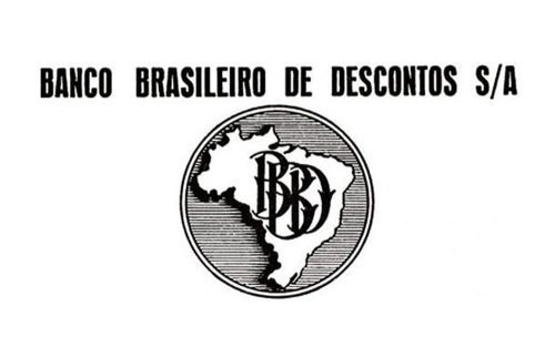
The logo, created for Banco Brasileiro de Descontos, was composed of a rounded emblem and lettering above it. The inscription in all capitals featured a bold narrowed sans-serif typeface that looked neat and confident in black. As for the emblem, it was a contour of Brazil, placed on a gray circular medallion. The country was executed in white and had a black outline, which was balancing the ornate and elegant black monogram, placed directly on the country’s silhouette.
1975 – 1980
Bradesco as a brand appeared in 1975, and the new logo was designed in the same year. It was a bold sans-serif inscription in a dark red color, where all the extra thick letters were placed pretty far from each other. The spacing made the whole logotype look light and fresh.
1980 – 1997
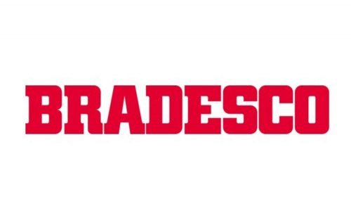
The new style was brought to Bradesco’s visual identity in the 1980s. The bold red inscription gained a new elegant serif typeface with sleek thick likes and rounded angles. The distinct square serifs looked stylish and sophisticated.
Throughout the years the logo was slightly redesigned and several new versions appeared.
1980 – 1988
This is how the lettering was complemented by a black square emblem with a yellow lightning bolt on it.
1988 – 1997
In this version, the wordmark was placed between two bold red squares, which added solidness and confidence.
1997 – 2009
The Bradesco logo we all know today was first introduced in 1997. It was an insignia with a new concept and a modern approach. The red square of the emblem was placed above the traditionally executed lettering in black. The emblem featured a white abstract image consisting of two vertical lines and two orbit-like curves and resembling a tree. This is how the company shows growth, success, and prosperity.
2009 – 2012
In 2009 the black of the lettering was switched to gray, and the lines on the emblem became thicker and brighter. Gray color added more elegance and a sense of professionalism to the bank’s visual identity.
2012
The redesign of 2012 brought a new shape to the emblem. Now the upper right and the bottom left corners of the red square got rounded, which made the whole logo very dynamic and remarkable.
2018 – Today
In 2018 the bank simplifies its visual identity, but after all the changes, it begins to look more modern and trendy. The new logo is an iconic Bradesco tree in red, placed above the lowercase inscription, also in red, on a white background. No framing, no geometric shapes, everything is simple yet extremely elegant.
Font and color
The Bradesco inscription in the lowercase is executed in a custom sans-serif typeface, which is very similar to Aller Bold and Chypre Cond ExtraBold fonts, but with the edges of the letters modified — the vertical bars of “B” and “D” has a diagonal cut.
The red and white color palette of the bank’s logo is a representation of power and energy, along with love and loyalty, which the company wants its customers to feel.


