

![]() Banana Republic Logo PNG
Banana Republic Logo PNG
Before the brand was purchased by Gap in 1983, it experimented with various banana-themed designs. In most cases, the old Banana Republic logo looked elaborate to the point of being cluttered.
Meaning and history
![]()
1978 – 1983
![]()
Banana Republic was established in 1978 by Mel and Patricia Ziegler. The first name of the brand was “Banana Republic Travel & Safari Clothing Company.”
1983 – Today
![]()
1983 emblem
The primary logo is basically just the name of the brand. And yet, it has a unique artistic touch due to the choice of typeface. At first glance, it may look like a sans serif type because the serifs are thin and light. They are also sharp, due to which you can compare them with the thorns on a rose.
The proportions of the glyphs are classic ones providing excellent legibility. We can also add that the glyphs are rather light. They feature strokes of varying width.
On the whole, the wordmark looks elegant and distinctive without losing its utilitarian purpose. Apparently, these characteristics of the logo are supposed to represent the brand’s approach to the style of the products it designs.
![]()
Icon
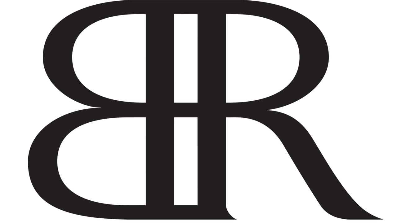
While the primary logo is used in the majority of situations when it is necessary to give a visual representation of the brand, sometimes there is just not enough space for the full logo. In these cases, the company uses a compact icon. It features the letters “B” and “R” positioned in a slightly unusual way. There is in fact just the mirror reflection of the “B.” It is placed with its vertical bar next to the “R,” so the two glyphs form a single shape.
This is a fresh approach that makes the icon memorable and distinctive. Due to it, the company stands out among its competitors using just the initials of the brand’s name as the icon.
The icon can be used separately or combined with the main wordmark.
Font
The Seta Reta NF Regular font looks very much like the one used in the Banana Republic logo. TFArrow-Medium is somewhat similar, at least some of the glyphs.
Colors
The palette consists of only two colors, white and black. In the primary version, the name of the company is given in black, while the background is white. However, in many cases, the reversed color scheme is used.
We can point out that the black-and-white palette is pretty characteristic of the logos of fashion brands. It gives the brand lots of freedom as such a logo can be placed over items of just any color. This would be impossible in case of a colored emblem, especially in case the color is an unusual one.


