The rock band Bad Brains was created in Washington, D.C., US, in 1977.
Meaning and history
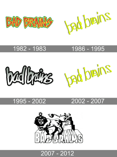
If you trace the evolution of the Bad Brains logo, you will notice that it has been modified quite often. In most cases, the way the wordmark has looked depended on the overall style of the cover. In other words, the logo has played a secondary part in comparison with the picture on which it was placed – it has been altered again and again to fit the visual context. This is a somewhat unusual approach.
Bad Brains (1982)
The cover of the debut studio album was developed by Mir (aka David Lee Parsons aka Dave Ratcage). The idea of the cover belonged to ROIR label boss Neil S. Cooper.
The sharp angles and rounded corners of the wordmark seemed to echo both the lightning bolt and the Capitol Building depicted on the album cover.
Rock for Light (1983)
The wordmark is dramatically different. In both the previous album and this one, the wordmark appeared to have been written by hand. Yet, while the 1982 logo featured block letters, the 1983 version showcased glyphs connected like in cursive handwriting.
What both the versions had in common was the casual, unpredictable, independent style.
I Against I (1986), Quickness (1989)
Once again, the letters appear to have been written by hand. Yet, the shape of the glyphs is different. One of the most characteristic features is the way the letters are squeezed together (especially the “ra” duet). Also, in contrast to the previous design, all the letters are lowercased here.
The 1986 version is different from the 1989 one only in the way the wordmark is positioned.
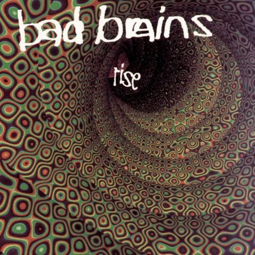
Rise (1993)
While the shape of the glyphs appears almost the same, the proportions have been slightly altered.
God of Love (1995)
The wordmark has been redrawn, although it has preserved its casual style and the “squeezed” effect.
I & I Survived (2002)
The shape of the letters appears the same as on the album covers from 1986, 1989, and 1993.
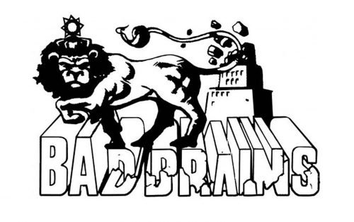
Build a Nation (2007)
A dramatically different style with heavy block letters. The complete overhaul of the wordmark was necessary to make it merge with the image where it was placed.
Into the Future (2012)
The one looks like no other Bad Brains logo. Although it features a cursive handwriting script, like some of its predecessors, the overall shape is different.


