Anvil are a heavy metal band based in Toronto, Ontario, Canada. It was created in 1978 and now includes three members. The number of studio albums it has released reached eighteen in 2020.
Meaning and history
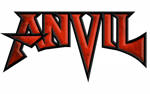
The shape of the Anvil logo alludes to both the name of the band and the music it plays.
If you compare the wordmark to the namesake metalworking tool used by blacksmiths, you will notice quite a few similarities. The multiple sharp ends of the glyphs (especially the lower part of the “V”) seem to echo the horn of the anvil. The arch formed by the lower parts of the letters is reminiscent of the curved base many anvils have.
While, technically speaking, the details on the ends of the letters are but serifs, their shape also bears something in common with details of the anvil.
Also, the multiple sharp elements bring to mind the metal weapons used by ancient warriors. The similarity between the “L” and an ax is especially obvious.
The “blacksmith” and “weapon” allusions are a literal embodiment of the style of music preferred by the band, heavy metal. So, even though this logo does not include actual pictorial elements, it still has a graphic quality and is meaningful enough to give a hint on the entity it belongs to.
Earliest logo
While the band has used the same logo over almost all its history, there has been one exception. The cover of the first album, Hard’n’Heavy, showcases a slightly different design that was probably used as an inspiration for the following, more professional emblem.
Colors
The Anvil logo is dominated by red. The letters have black trim and white highlights adding some depth and motion. Red as the color of blood and black as the color of the night seem to perfectly fit the overall brutal style of the wordmark.
Summary
On the whole, the logo does a good job of representing the band properly. This can be said both about the shape of the letters and the palette. And yet, the design, unfortunately, lacks identity – it looks like a typical “metal band” logo (you can remember the Metallica wordmark as a classic example). In other words, this is a good safe choice without anything daring about it – it lets the music speaks for itself.


