Aunt Jemima is the former name of a legendary pancake mix and maple syrup brand, established at the end of the 1880s, and owned by PepsiCo. The iconic label had to undergo a complete rebranding in 2021 because of being accused of racism. Today the name of the brand is Pearl Milling Company.
Meaning and history
The Aunt Jemima logo was invented in 1889, the prototype of the dark-skinned woman depicted on it was Nancy Green, who was a slave. The name of the syrup was borrowed from the song Old Aunt Jemima, which, according to legend, was sung by slaves. The chosen image had already been criticized many times in the late 20th century for evoking a false nostalgia for the mores of the slave-owning South during the American Civil War.
The design of the syrup has repeatedly changed, most recently in 1989, marketers rejuvenated Jemima, adorning her image with a snow-white lace collar and pearl earrings. At the same time, from the point of view of supporters of racial equality, the situation has not changed: in the 1930s in radio commercials black Jemima was voiced by a white actress, and in commercials used the situation when the black maid serves whites.
What is Aunt Jemima?
Aunt Jemima is an iconic American brand of pancake mix and syrup, which was founded in 1889, and kept being one of the most recognizable products in its segment until 2021 when the label had to completely change its name and logo because of the racism protests.
In terms of visual identity, the original Aunt Jemima brand had its logo based on a portrait of a smiling black woman for more than 130 years. The badge was redesigned several times throughout the years and has completely deleted the graphical part only in 2020. However, in 2021 the logo for a rebranded name was introduced, and it has nothing in common with the legendary insignia.
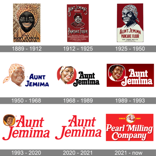
1889 – 1912
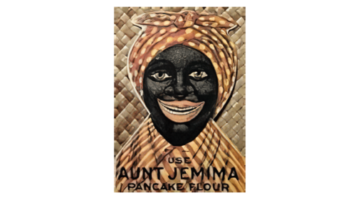
The very first logo for Aunt Jemima was created in 1889 and stayed with the brand for more than twenty years. It was a very artistic and bright emblem with an image of a black woman wearing a red and yellow scarf on her head. The checkered pattern of Jemima’s clothes was supported by the background of the logo, which featured an intertwined straw design. The badge was accompanied by black lettering in a modern sans-serif font.
1912 – 1925
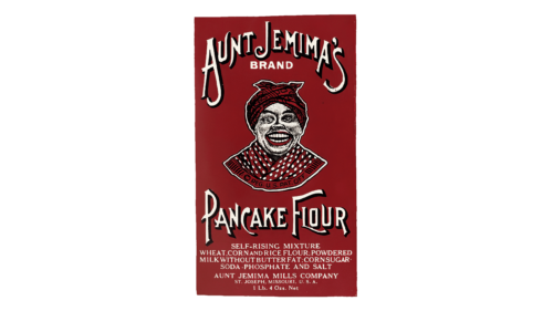
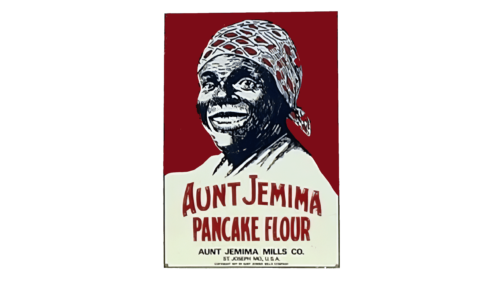
The redesign of 1912 has redrawn the Aunt Jemima logo in a red, black, and white color palette, with the portrait being refined, and the smile of the woman becoming even wider and warmer. The portrait was accompanied by a white outlined lettering in an elegant custom font, set above the beyond the image, and complemented by the white uppercase inscription with additional information.
1925 – 1950
In 1925 the badge was redrawn again, keeping the color palette of the previous version, but minimizing the lettering part. The closest Oman’s portrait was now enlarged and became a full-fledged star of the composition. As for the inscription, it was now written in red capitals over the cream robe of the woman.
1950 – 1968
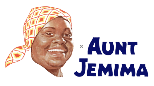
The redesign of 1950 introduced a more modern and realistic image for the brand. The portrait of Jemima was redrawn with volume and natural shades and got placed on a white banner on the left from the two-leveled inscription in blue. The lettering was set in bold custom font with interesting waves in some of the bars.
1968 – 1989
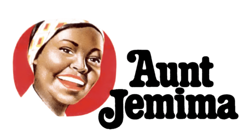
The image was refined again in 1968, with the modernized portrait being placed in a solid red roundel. The logotype was also rewritten, and now featured a bold and slightly narrowed rounded serif typeface with very friendly and smooth contours of the characters. The color of the inscription was switched to black.
1989 – 1993
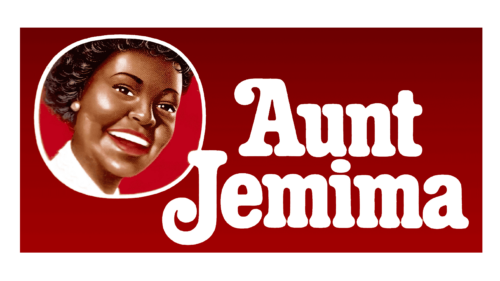
The redesign of 1989 has refined the Jemima portrait, and now the roundel was outlined in white, in order to be more visible on the new gradient-red background. The font of the lettering remained untouched, but the color of the characters got switched to white to create a more balanced look for the banner.
1993 – 2020
In 1993 the color palette of Aunt Jemima’s visual identity was switched to white, orange, and red, with the medallion getting a gradient-orange background and a red outline, and the inscription changing its typeface and becoming red. The new font was a cleaner and italicized version of the previous one, with the rounded elements getting straighter and more distinctive.
2020 – 2021
The redesign of 2020 followed the wave of racist scandals. The brand decided to remove the graphical part from its badge, keeping only the two-leveled inscription in red, with the typeface adopted from the previous version, but made more elegant, and the red — lighter. This logo was used for only a few months and was the last insignia in the Aunt Jemima history.
2021 – Today
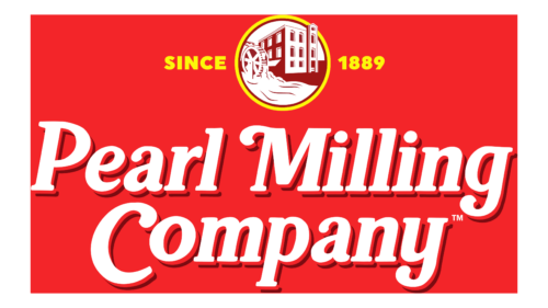
In 2021 the iconic brand got renamed Pearl Milling Company, and its logo was completely redesigned. The only thing left from the previous version is the typeface, but now the name of the brand was set in white, with a dark red shadow, and placed against a solid red background. The inscription is accompanied by a roundel in a yellow outline, with the building image on it, enclosed between two parts of the yellow “Since 1898” lettering.
Font and color
The smooth and elegant lettering from the primary badge of the Pearl Milling Company badge, as the one from the last Aunt Jemima insignia, is set in the title case of a bold and fancy font, which is pretty close to such typefaces, as Hallen Regular, or FF Marselis Serif Pro Black, with some significant modifications of the contours.
As for the color palette of the Aunt Jemima visual identity, its main shades are red and white, the symbols of passion, warmth, and love. The other the addition of yellow in the newest version of the badge, the palette became more vivid and energetic.


