Though the famous video game had its release in 2007, its visual identity has been more than just consistent — the emblem, introduced for the game in the very beginning hasn’t changed at all.
Meaning and history
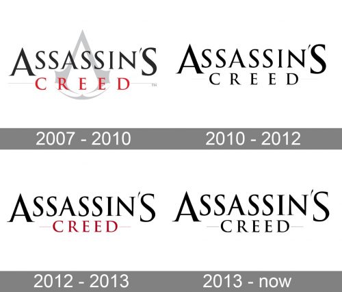
In spite of the multiple modifications the Assassins Creed logo has gone through, it has stayed basically consistent. Each new version matches the country or region the story is set in, the sects of the Order etc.
2007 – 2010
The logo, created for Assassin’s Creed in 2007 is composed of two main elements — the wordmark, which contains two levels of lettering in black (for Assassin’s) and red (for “Creed”), where both parts are executed in the same sleek and sharp serif typeface. Though the two parts of the inscription have all letters capitalized, the upper line’s “A” and “S” are enlarged, and create a frame for the bottom level.
The second element of the Assassin’s Creed visual identity is its icon, which is often used on its own, executed in monochrome, but is also placed on the background of the official logo. In this case, the sharp “A”-like element, which resembles an Illuminati compass, is drawn in light gray, leaving the main place on the stage for the nameplate.
2010 – 2012

The redesign of 2010 changed the color palette of the Assassin’s Creed logo to black-and-white and removed the light gray emblem from the logo’s background. Now it was just a two-leveled inscription in the corporate typeface, with the bottom line “Creed” having its letters placed far from each other and decorated by two thin and short horizontal lines on the sides. The upper lines of the inscription stayed untouched.
2012 – 2013

In 2012 the logo was changed again, with the dark shade of red being returned to the badge. The bottom line was now contrasting with the black “Assassin’s”, and got a bit rewritten, having less space between the letters, and thus looking more compact and delicate. As for the horizontal lines, they were still there, but now also red, more visible, and for that reason looking a bit longer than they were on the previous version of the badge.
2013 – Today
The black and white color palette was brought back to the Assassin’s Creed logo in 2013. It was, actually, exactly the same composition as the one, used by the game in 2012, but in the color palette of the badge from 2010. Simple and elegant, thus instantly recognizable, this badge is the most long-lasting along all, created for Assassin’s Creed throughout the years.
Emblem
If you take a closer look, you may notice that the emblem has a lot in common with Illuminati symbolism (square and compasses). Also, it bears some resemblance to the bottom side of an eagle skull. Most versions are vertically symmetrical, yet the earliest Levantine symbol and the Russian one do not obey the rule.
Origins symbol
The 2017 version of the game, Assassin’s Creed Origins, features the logo with an Egyptian twist: the All-Seeing eye is clearly visible in the middle of the emblem. It reminds that the game is set in Ptolemaic Egypt (305 BC-30 BC).
Font and Color
The sleek sophisticated uppercase lettering from the primary logo of the Assassin’s Creed franchise is set in a classy serif font with sharpened thin ends of the bars. The closest commercial fonts to the one used in this insignia are, probably, Trajantrade, Goudy Trajan Protrade, and Goudy Titling, with minor modifications.
As for the color palette of the Assassin’s Creed visual identity, it is based on black, which is usually combined with white, but sometimes bloody-red details can be added. The chosen scheme characterizes the plot and mood of the game better than any other.


