Asko is a Swedish brand of household appliances, established in 1950 by Karl-Erik Andersson (the inventor of a washing machine). The Scandinavian company specializes in manufacturing major appliances, such as washing machines, refrigerators and dishwashers.
Meaning and history
Asko got its current name only in 42 years after its launch.
ASKO is a Swedish brand of large home appliances, owned by the Gorenje Group.
The beginning of the history of ASKO is considered to be in 1950. That’s when farmer Carl-Erik Andersson produced the first washing machine “Junga Verkstäder” and founded the company of the same name.
The washing machine was made at the request of Adrersson’s mother, but it soon became mass-produced.
The company later became known as Cylinda. Thirty years later the company enters the markets in Norway, Denmark, the USA, Australia, and New Zealand.
In 1988, Asko and Cylinda merged under the name Asko Cilinda. In 2000 the company was acquired by Antonio Merloni.
Today the company produces a full range of large home appliances – washing machines, dryers and dishwashers, kitchen hoods, electric stoves, hobs and ovens, and refrigerators. All these appliances are available as freestanding and built-in versions.
What is Asko?
Asko is the name of a European company, which was established at the beginning of the 1950s, and is specialized in the production of consumer electronic items. The company is focused on large electro domestic appliances, such as washing machines and refrigerators.
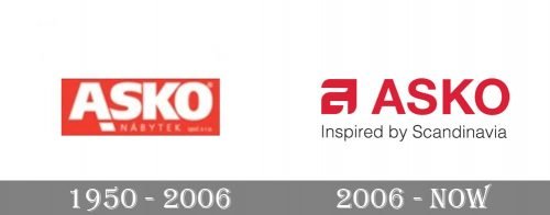
1950 – 2006
In 1950 it was called Jung Verkstäder, then, after acquisition by Asea in 1978, Asea Cylinda. The name changed again in 1988, after the brand was bought by Finnish furniture company Asko. The brand was named Asko Asea until 1992.
2006 – Today
The Asko logo is a bright red all-caps wordmark in simple clean serif font and the “A” icon in the beginning of the logo. There is also a fine tagline in classic gray “Inspired by Scandinavia”.
The bold graphic image of the letter “A” is not just part of the logo, but is a brand’s signifier, used on websites and where there is a need of shortening the company’s name.
Font and Color
The clean and stable uppercase lettering from the primary badge of Asko is set in a modern geometric sans-serif typeface with straight cuts of the characters’ bars. The closest fonts to the one, used in this insignia, are, probably, Neue Helvetica Georgian 75 Bold, or M Ying Hei PRC W7.
As for the color palette of the Asko visual identity, it is based on a calm yet deep shade of red, which looks very smooth and chic. The color evokes a sense of passion and excellence, showing the customers’ comfort as the main value for the company.


