Newegg is an American brand of computer hardware and accessories retailer, which was created in 2001 by Fred Chang. Today the company is not only selling products, but also manufactures it under the brand Rosewill.
Meaning and history
Newegg was founded in 2001 by an American entrepreneur of Taiwanese origin, Fred Chang, and originally operated only in the United States. However, during an investment deal in 2016, the Chinese company Liaison Interactive acquired a controlling stake in Newegg. And now the online store, in addition to the U.S., sells its products in 19 other countries around the world.
Newegg is consistently considered one of the best online shopping destinations, and the company regularly receives industry-leading customer service ratings.
The name Newegg means hope for e-commerce, especially during its difficult initial phase. After all, the store was founded in the very distant year 2001. And since the egg symbolizes birth and limitless potential, the name was chosen as the brand name.
What is Newegg?
Newegg is an online store that sells consumer electronics and computer equipment. The company’s office is located in California, USA. Newegg store is known among customers for fairly low prices for most of the products in its catalog. The company was founded in 2001.
2001 – 2004

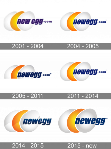
The original Newegg logo was introduced by the e-commerce platform in 2001 and stayed unchanged for the first three years. It was a graphical emblem, composed of three eggs, placed overlapping and slightly diagonally. Two white eggs were complemented by a gold one in the middle. The lettering in the lowercase was set in purple, crossing the emblem horizontally.
2004 – 2005

The redesign of 2004 has refined the contours of all elements on the Newegg badge, cleaning the lines and making them more distinctive. The logotype was rewritten in a stronger and more geometric typeface, with the two-part of the company’s names placed close to each other. The color of the lettering was switched from purple to blue.
2005 – 2011

In 2005 the color of the letters got darker, and the bottom part of the badge was cut, creating a straight and stricter composition. As for the eggs, their palette and contours remained the same. This badge was in use by the platform for six years.
2011 – 2014
The redesign of 2011 has returned the full-shaped logo of the Newegg online store. The lettering got lighter and brighter, while the golden egg gained some orange gradients, which made the whole badge more confident and bright. This was the last version of the logo with the “.com” part of the wordmark.
2014 – 2015
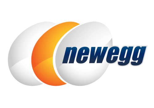
The logo, introduced in 2014 got its lettering shortened and darkened up, with the graphical part gaining some light spots at the bottom of the eggs, which made the whole badge look more voluminous and delightful. Although; this version only stayed active for a few months.
2015 – Today
The company’s name is a celebration of new life and a huge potential of the e-commerce. It appeared on the market, when online shopping wasn’t much popular and developed, but the brand made its bet and won.
The Newegg logo is composed of a wordmark and a graphical image. The wordmark in all-lowercase is slightly italicized and executed in bold traditional sans font with clean thick letters.
The Newegg emblem is an image of three eggs — two white and the yellow one in the middle. The eggs are layered, which creates an impression of eternity and progress.
The color scheme of the logo is blue, white and yellow, which symbolizes the brand’s creativity, energy and responsibility. The blue color of the wordmark adds a feeling of high quality of service the brand provides, while the combination of white and yellow of the emblem makes the logo fresh and crispy.


