Throughout more than 50 years of its history, the ASDA logo has always been more of a wordmark than an image. Although a couple of versions were embellished by graphic symbols, they were later replaced by more minimalistic logos.
Meaning and history
There have been two distinct periods in the history of the Asda logo. In 1985, the British supermarket retailer based in Leeds adopted a capitalized green wordmark that has been used, with subtle updates ever since. Originally, it used a white-and-black logo, which was followed by a series of orange logos.
1965 – 1968
The company was established in 1949 as Associated Dairies and Farm Stores Ltd. In 1965, the business of the Asquith brothers merged with Associated Dairies to form Asda. The name was made up out of the first two letters of the words “Asquith” and “Dairies.”
In the logo introduced in 1965, the company name is capitalized. It is small in comparison with the word “Queens” (the old name) and has a large crowned “Q” next to it.
1968 – 1970
The era of the lowercase logo with an orange palette started. The type was as simple as in the previous version but had different proportions. It was a sans serif font with subtle variations in the width of the strokes.
The design was very minimalist – nothing but the name of the brand in burnt orange.
1970 – 1981
The wordmark went white and was placed over the burnt orange background. It formed a rectangle with rounded corners. Inside the rectangle, there was a stylized wave (above the wordmark) and the word “Superstores” (below the wordmark).
While this version carried more meaning than its predecessor, it appeared slightly too cluttered.
1981 – 1986
The rectangle was replaced by a parallelepiped with rounded corners (although the rectangle was still used on some occasions). The wave was moved to the left of “Asda” and became dark blue. The word “Superstores” grew smaller, was moved out of the parallelepiped, and was also colored blue. The burnt orange was replaced by a cleaner, more vivid hue.
1986 – 1994
This is when the green capitalized Asda logo was introduced. Ever since, the company has been experimenting with various shades and additional effects but has never changed the core.
The new design looked by far more modern, straightforward and easier-to-grasp than its predecessor. And yet, the type was generic, which meant that the logo sacrificed some of its recognizability.
In this version, there were blue shades around the letters, while the counters of the “A’s” were colored.
The fresh look was commissioned in 1984 by John Hardman, who had been appointed as Managing Director.
1994 – 2002
The yellow and red counters disappeared, while the yellow shades were replaced by dark green ones. The glyphs grew slightly higher.
As a result, the wordmark lost its childish look that didn’t seem appropriate for the brand.
1999 – 2002
The shades became wider, which made the 3D effect far more pronounced. The previous logo was still sometimes used in TV ads.
2002 – 2006
The shades were removed altogether leaving a clear and transparent design. While in the previous versions, the letters considerably overlapped, they were now moved a little further from each other. This reduced the impression of scarcity, which resulted from the squeezed glyphs in the old logotypes.
2006 – 2015, 2017 – 2024
2015 – 2017
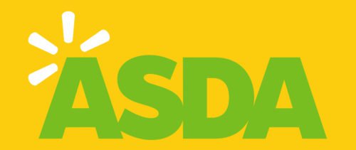
Above the “A,” a sunburst made up of four yellow rays appeared. This element hinted at the fact that Walmart was Asda’s owner (you can see the same sunburst in the Walmart logo).
2024 – Today
Emblem
In 1968, the British supermarket retailer dropped the word “Queens” from its name and adopted the orange wordmark logo, in which only the first letter was capitalized. In 1970, the colors were inverted, while a stylized “wave” was added to the wordmark. The 1981 version featured a more complicated shape and a blue “wave”.
Symbol
In 1985, the era of simpler all-cap wordmarks started. The counters of the first and last letters in the original logo were colored yellow/blue and red respectively. In 1994, the colored counters were replaced by the white ones. In five years, the 3D effect, which had been already present on the logo, was emphasized. However, the company got rid of it as soon as in 2002.
The 2015 version emphasized the connection to the Walmart, ASDA’s parent company, by adding a “spark” to the top left corner. Yet, the current version does not include this element.
Font
The geometric sans serif typeface looks extremely close to the rather popular font called Futura ExtraBold.
Color
Since 1985, the designers have been experimenting with different shades of green. The current ASDA logo features the color with the code #33cc33.


