Armani Exchange is a casual and streetwear subdivision of the famous Italian luxury brand, Armani. The label was created in 1991 and is focused mainly on the young audience.
Meaning and history
Armani Exchange is a youth brand created by oneof the most famous Italian designers and the owner of Giorgio Armani fashion house. Armani Exchange was inspired by the street style, bright images, rebelliousness, and stylish dance music. The line became the embodiment of freedom and individuality.
Armani Exchange was created as Armani, affordable to everyone. This line for young peoplewas founded in 1991 in the U.S. and today is one of the leading brands in the world. Armani Exchange designs manufacture and distributes stylish products including apparel, accessories, eyewear, watches, jewelry, and music. There are more than 140 Armani Exchange stores worldwide, where you can buy the full range of the brand’s products. The brand continues to grow, both in the U.S. and in the UK, Brazil, Argentina, Mexico, Korea, Japan, and China.
What is Armani Exchange?
Armani Exchange is the line of clothing and accessories from the iconic Italian fashion house, Armani. The Sub-brand was established in 1991, with the idea of creating affordable clothes for the young audience. Today the brand has its products sold worldwide.
Before 2009
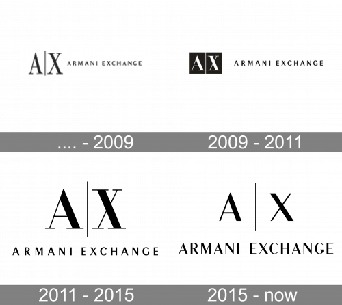
The very first Armani Exchange logo was used by the fashion brand until 2009. It featured an icon with two enlarged capitals “A” and “X” separated by a thin vertical line. The icon was followed by a logotype in small caps, set in a medium-weight black line against a white background.
2009 – 2011
The redesign of 2009 has emboldened and extended the letters in the icon and redrew them in white over a solid black square. As for the lettering, its size was also slightly enlarged and the lines of the characters became bolder; making the whole badge look more stable and solid.
2011 – 2015
In 2011 the Armani Exchange logo gets another redesign, with the letters of the icon being set in black again, and placed against a white background above the large uppercase logotype; written in one straight line. The new badge looked more balanced than the two previous versions.
2015 – Today

Armani Exchange is the most affordable fashion line of the iconic brand. It is created for young people, who are free and energetic. And the brand’s visual identity is a good reflection of its philosophy.
The Armani Exchange logo is minimalist yet sharp and strong. It is composed of a wordmark and an icon above it.
The wordmark in all capital letters is executed in a more Sm sans-serif typeface, where the letters are slightly narrowed, leaving enough free space between the words.
The Armani Exchange Icon comprises two letters — “A” and “X”, which are both capitals and divided by a thin vertical line. The letters feature sans-serif font with bold and strict lines.
This clean and strong emblem is used by the brand on its own, without a wordmark part. It can be seen on the websites and label’s packaging, as well as clothing tags.
The monochrome palette, which is common for the fashion industry, makes the brand look powerful and stylish. The “AX” monogram is sometimes executed in white and placed into a black rectangular, but the traditional black lettering on white is more usual.
Font and Color
The sleek uppercase inscription from the official logo of Armani Exchange is set in an elegant sans-serif font, with the letters in bold clean lines. The closest font to the typeface, used for the Armani Exchange visual identity, is, probably, Peignot Std Demi.
As for the color palette of the Armani Exchange visual identity, it follows the rules of the global fashion industry and sets all elements of the badge in black over a plain white background. Elegant and timeless.


