Ariston is an Italian brand of domestic appliance manufacturer. It was established in 1960. Today the company is known under the name Ariston Thermo and operates all over the world, specializing mainly in production of electric boilers.
Meaning and history
The Ariston logo is a celebration of cozy home feeling. It’s burgundy and white color palette evokes a sense of warmth and comfort, while the modern custom typeface adds modernity and energy.
The custom font lettering is clean and laconic, neat all-caps wordmark is complimented by the brand’s emblem – a silhouette of the house with a window.
The brand’s name means “the best” in Greek and the company aims to provide their customers with the best products of the highest quality and contemporary design.
The Ariston logo is modern, powerful and dynamic, perfectly reflecting the feeling of harmony and happy home.
What is Ariston?
Ariston is an Italian brand of domestic electronic products, which was established in Italy at the beginning of the 1930s. Previously the company was mainly known for refrigerators, washing, and drying machines, but today its focus has been shifted to thermal systems and related products.
1960 – 1962
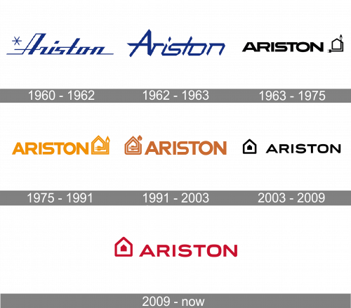
The logo, created for Ariston in 1960, was composed of stylized lettering in the dark and bright shades of blue, with its cursive title case characters having square shapes, and straight cuts of the lines. The inscription was accompanied by a minimalistic blue snowflake, set on its left and composed of three crossed straight lines.
1962 – 1963
The redesign of 1962 has kept the shade of blue from the previous badge, but removed the graphical part and switched the typeface of the Ariston wordmark to a more modern and edgy cursive. The lettering looked very progressive and futuristic, with some of the lines sharpened.
1963 – 1975
In 1963 the Italian company starts using a completely different design for its visual identity. The new concept was built around a bold uppercase logotype in a modern sans-serif, followed by a stylized minimalistic emblem, depicting a contour of a house, made of one line, with the plug on one end, and the small flame on the other.
1975 – 1991
The Ariston logo, designed in 1975, repeated the composition of the previous badge but used bright orange color Dow all the elements. The typeface of the uppercase logotype was switched to a more traditional sans-serif, while the emblem was redrawn in bolder lines, with a thick orange contour accompanied by a thin white line in the center.
1991 – 2003
With the redesign of 1991, the emblem moves to the left from the logotype, and the bright orange shade is changed by a calm brown. Both the inscription and the graphical part got their contours refined, with the typeface remaining, but the lines of the letters refined and cleaned.
2003 – 2009

In 2003 the Ariston logo becomes more modern and switched its color palette to black and white. The emblem is now composed of a complete contour of the house with a small solid black silhouette of the same shape in the center. As for the lettering, it got its typeface changed to a stylish and contemporary sans-serif with lots of air between the characters.
2009 – Today
The redesign of 2009 was all bout the color palette of the Ariston badge. Black was changed to intense red, keeping the contours of the elements almost untouched, but the emblem got bigger, with the small solid house getting more visible and distinct.
Font and color
The stylish uppercase lettering from the primary Ariston badge is set in a modern and sleek sans-serif typeface with bold lines and some of the angles slightly softened. The closest font to the one, used in this insignia, is, probably, Organetto Bold Semi Ext, but with rounded corners and smoother lines.
As for the color palette of the Ariston visual identity, it is built on a deep and intense shade of red, which represents warmth and energy, which the company gives to its customers through its products.


