 Archer Daniels Midland Logo PNG
ADM is a corporation working in the food processing and commodities trading industry. Its assets include over 270 plants and 420 crop procurement facilities in various corners of the globe. As of 2021, the company is ranked No. 54 on the Fortune 500 list of the largest US corporations. ADM is based in Chicago, Illinois.
Meaning and history
The Archer Daniels Midland logo has gone a long way before it adopted the sleek and effective look it has today.
What is Archer Daniels Midland
The Archer-Daniels-Midland Company is a Chicago-based agricultural processor’s business. The range of products it deals with includes everything from animal feed and human food to cosmetics and paint.
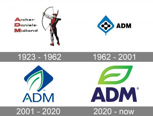
1923 – 1962
The company’s roots can be traced back to 1902, when Daniels Linseed Co. was established in Minneapolis. However, it was only in 1923 that it was renamed Archer Daniels Midland Company.
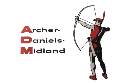
The first logo that reflected the new name was rather heavy and looked more like a picture than a commercial logo. Then again, it was just a product of its time.
The left part of the design was occupied by the full name of the brand. It was given in three lines. The initials were bold, capitalized, and were colored red. All the other letters, by contrast, were light, lowercase, and black. This helped to emphasize the abbreviated version of the company name – it was formed by the initials positioned one above another.
The most unique element of the ADM logo, though, was the figure of an archer depicted in full height. He was holding a bow, ready to shoot. The costume looked pretty much like that of Robin Hood, with the iconic bycocket.
1962 – 2001
This version doesn’t seem to share anything in common with its predecessor, except for the letters “ADM.” However, even the abbreviation now looks different. It is placed in the right-hand part of the emblem and is black, in contrast to the red letters from the previous logo. The glyphs are bold and belong to a sans-serif type. They have a more elongated shape than in the previous version.
The archer is gone. Instead, there is a rather abstract emblem combining a leaf-inspired blue shape with the white middle part. At the very center, there is a black rhombus. There are black circles positioned on each of its points (four circles altogether).
The leaf theme creates a link with the fact that ADM works with agriculture products.
2001 – 2020
This time, you don’t have any doubts about whether there’s a leaf or not. Although the lines are pretty light and there’s only the outline, no mistake is possible here, in contrast with the abstract blue leaf of the previous version.
The name of the brand now features a lighter type. Due to this, there’s a lot of air in the Archer Daniels Midland logo, although the legibility slightly suffers.
2020 – present
A cleaner, easier-to-grasp version still features the leaf. The company’s new tagline, “Unlocking Nature. Enriching Life,” explains why the leaf is there. The blue background shape seen in the previous logo has disappeared, which contributes to the cleaner look.
The curves forming the leaf are by far bolder. The same is true for the wordmark. As a result, the two parts of the design seamlessly merge and are perfectly visible.
Colors and font
The palette reflects the message of the logo. Green is the most obvious choice for the leaf shape, and, together with the leaf and the “Unlocking Nature” tagline, they work towards the common goal.
What is peculiar about the type used in the Archer Daniels Midland logo is the way some of the angles are rounded. Note, for instance, the lower angle of the “D” or the top right-hand corner of the “M.” Such a shape echoes the leaf above and helps to merge the two elements.


