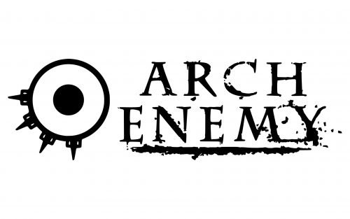
Arch Enemy, a melodic death metal band from Halmstad, Sweden, was created in 1995. It has been exceptionally consistent in its visual brand identity – the Arch Enemy logo has looked almost the same over the band’s more than 25-year history.
Meaning and history
The two parts of the logo, the wordmark and the symbol, have been typically used independently. Although they have appeared on the album covers together, their mutual proportions and position have been a subject of constant change, which is unusual for a typical logo.
Stigmata (1998)
The second studio album already features the combination of the characteristic serif type and the circular emblem.
At first glance, the type may seem quite generic. Yet, if you take a closer look, you will notice several distinctive features, including the angle at while the serifs on the “C” and “E’s” are placed, the shape of the diagonal bar of the “R,” the varying widths of the strokes, etc.
The symbol, which is positioned to the right of the wordmark, consists of a small circle placed inside a larger circle (not unlike a bullseye). What makes the symbol unique is the series of four “thorns” or pins.
There have been quite a few interpretations of the symbol. We can mention the most obvious one (the eye), which can be supported by the fact that the symbol is often placed next to a face without the eye. The “thorns” resemble the eyelashes.
Another interpretation is that it’s a modified symbol of Anarchy. While this is not exactly an anarchy band, they often sing about things that are related to anarchy (individual freedom, liberty, and revolution). Even the name of the band is made up of almost all the same letters as the word “anarchy,” which only supports this interpretation.
Burning Bridges (1999)
The bullseye has grown larger in comparison with the wordmark and has moved to the left. Once again, there is a face with one of its halves in the darkness (thus, we can’t see the eye).
Wages of Sin (2001)
The symbol has become enormous and now dominates the album cover. The central circle resembles a planet.
Anthems of Rebellion (2003)
Here, the similarity of the roundel to an instrument of torture is even more obvious than on the previous covers. This is partly due to the red color.
Doomsday Machine (2005)
The bullseye adopts plenty of details. The central “pupil” has been transformed into a skull.
Rise of the Tyrant (2007)
The wordmark here looks bolder than in any other version
Khaos Legions (2011)
Once again, the bullseye becomes an essential part of the image depicted on the cover rather than an independent logo (this time, it is depicted on the flags).
War Eternal (2014)
The pictorial part of the Arch Enemy logo has been moved to the background.
Will to Power (2017)
The roundel is almost lost among the multiple details. Yet if you take a closer look, you will notice it on the goat’s forehead.


