Aramark is a global food service, facilities management, and apparel company. Aramark focuses on delivering high-quality service and innovative solutions, emphasizing food sustainability, wellness, and customer experience. It operates in numerous countries and employs thousands of people, serving millions of customers daily. Today, the company is a trusted partner to many esteemed organizations, including schools, hospitals, sports venues, and Fortune 500 companies. The company is also deeply committed to giving back to the communities it serves.
Meaning and history
In 1936, the business was established under the name Automatic Retailers of America (ARA). In the beginning, Aramark operated a nationwide automated vending machine business. To expand, ARA purchased Davidson Brothers, a school food service firm, in 1960. The business thrived and changed its name to Aramark in the 1970s. It has branched out into uniforms, facility management, and catering. At the moment, Aramark employs over 270,000 people and has operations in more than 20 countries.
What is Aramark?
Aramark is a provider of food service, facility management, and uniform services to a variety of industries. Its focus on service quality, innovation, and sustainability has made it a prominent player in the food services and facilities management industries.
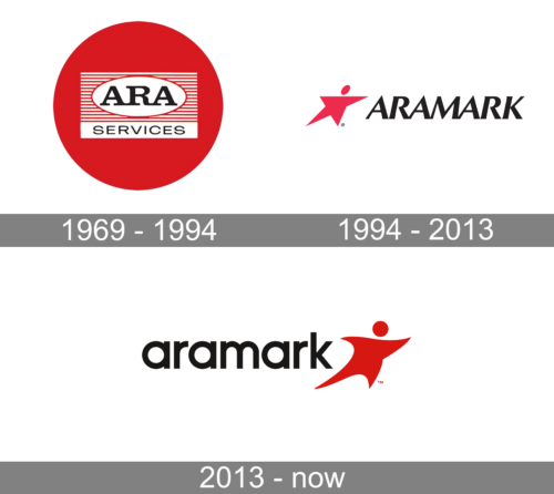
1969 – 1994
The logo consists of multiple layers stacked on top of each other. At the very center, there is a white oval shape with “ARA” printed in bold, serif font using all caps. Behind, there is a red and white striped rectangle. It has a white banner at the bottom that has “Services” printed using a finer font with all caps. The round red base is a symbol of unity and Aramark’s commitment to serving its community. It might also represent signifying its dedication to providing seamless, end-to-end services that bring people together.
1994 – 2013
The iconic Aramark company logo features its name, which is accompanied by a bold red star stylized like a human figure. The star is often associated with excellence and guidance. Meanwhile, a person with outstretched arms in the logo reflects the company’s mission to enrich and nourish lives by serving others and making a positive impact on the communities it touches. The name is printed using bold, sans-serif font with slightly tilted characters, which gives the logo dynamics and a feeling of progress.
2013 – Today
The new bold, modern design of the logo is a nod to its innovative spirit and forward-thinking approach to hospitality, facilities management, and uniforms. The company preserved the stylized star but gave it a more fluent and smoother shape. This simple, yet powerful symbol brings a sense of warmth and inclusivity. The name is printed using lowercase characters, which further enhances the approachable and caring nature of the brand. At the same time, the bold strokes and minimal spacing between the characters show that this is a powerful and respected brand.
Font and Color
The vibrant red color, which was used alongside black, adds an energetic and dynamic touch. It represents the company’s passion for innovation, creativity, and progress. Meanwhile, the black gives it a strong and professional touch. This is a classic color that does not limit the company in the direction it desires to take.
The earlier logo version features two fonts. One of them is a bold font with slab serifs that resembles the Eroika Slab Medium font. The other is a finer font without serifs that looks like Porter FT Round Semi Bold font or Trivia Gothic X3 Expanded Regular font with terminals being rounded. The logo introduced in 1993 features A bold, oblique font with flared strokes and a modern and elegant style. It resembles Optima Pro Cyrillic Bold Oblique font. A modern, geometric sans-serif font similar to the Gilroy Semi Bold font was introduced in 2013.


