

![]() Aquafresh Logo PNG
Aquafresh Logo PNG
Aquafresh is the name of toothpaste and oral care brand, launched in 1973 by Smith Kline & French Laboratories, a company which today is known as GlaxoSmithKline, or simply GSK, a British pharmaceutical corporation, one of the most reputable in the world in its segment.
Meaning and history
![]()
The history of the Aquafresh oral care brand began in Portugal at the end of 1972. The manufacturer produced innovative toothpaste. The company has several technological laboratories and about a dozen centers for research, constantly monitoring the products to improve the composition of toothpaste and develop new ones. The target customer segment is the family who cares about dental health and oral hygiene.
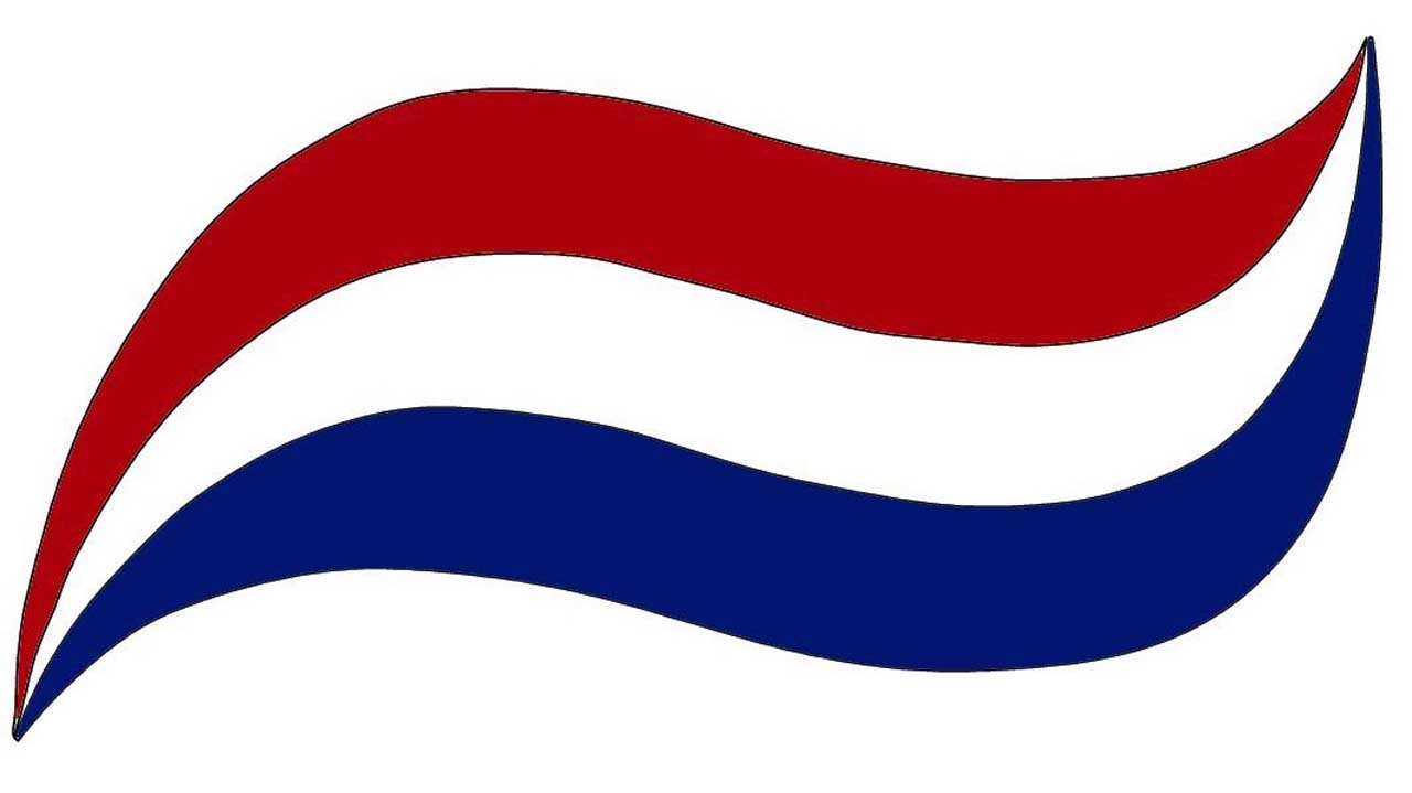
The first Aquafresh toothpaste is best known for its white, blue, and red tricolor, which can be seen not kinky on the emblem of the brand, but in the toothpaste itself. At first, the paste was two-color, the white band of fluoride was responsible for the care of tooth enamel, and the second, made of blue gel, gave breath freshness. Later, a third color, red, was added to the toothpaste and is supposed to stand for healthy gums.
What is Aquafresh?
Aquafresh is a famous international brand of toothpaste, toothbrushes, and other oral care products, established and owned by GSK pharmaceutical corporation at the beginning of the 1970s. Today the products of the brand are sold in supermarkets all over the globe, competing with Colgate in the race for the “most popular toothpaste” title.
In terms of visual identity, Aquafresh is the brand, that likes changes, as the number of updates the Aquafresh logo has gone through during its almost 50-year history has reached at least eight, and not all of the badges are executed in the same style and color palette — there were several interesting experiments.
1973 — 1986
![]()
The original Aquafresh logo, designed in 1973, stayed with the brand for more than a decade. It was a black and white banner with the bold white italicized logotype in a clean and modern sans-serif typeface with the letters shadowed in black. The inscription was set on a background with a striped pattern and had a two-colored waving banner above it, symbolizing the “touch” of the brand’s toothpaste, which was blue and white at that time.
1986 — 1989
![]()
The redesign of 1986 redrew the logo in the blue and white color palette, placing both the inscription and the stylized emblem; set above it, on a plain white background. The lettering was now set in a smoother and narrower typeface with its bold letters in solid blue. As for the graphical part, the smooth line was also set in blue and had a wide white horizontal stripe crossing it. The emblem was placed above the “Aqua” part of the badge, starting on the right from the capital “A”.
1989 — 1992
![]()
At the end of the 1980s, the red stripe was added to the Aquafresh toothpaste, and it was reflected in the new logo, introduced in 1989. Although the intense blue color was replaced by turquoise now. The new logo was composed of a massive italicized logotype in a bold sans-serif typeface with jo space between the letters. The inscription was placed above the tricolor arched banner, formed by three thick strokes: red, white, and turquoise.
![]()
1992 — 1996
![]()
The redesign of 1992 removed the graphical part of the logo, keeping only the lettering in the new typeface and shade of blue. It was a bright and delightful light blue color, in which the titlecase sans-serif lettering looked cool and modern, evoking a sense of menthol taste and fresh breath, after using the products of the brand. The logo stayed with no graphical for almost four years.
1996 — 1998
![]()
In 1996 the lettering adopts a rich, saturated shade of blue, its typeface is being replaced by a more sophisticated and smooth sans-serif, with the lines getting thinner to their ends, and the corners softened. The graphical part of the logo comes back in the new intense palette, and the toothpaste stroke colored red, white, and blue can be seen below the inscription, in the center.
1998 — 2005
![]()
The redesign of 1998 makes the Aquafresh logo flat again, removing the gloss and gradients from the palette. The letters are sloped a little more, the blue looks a bit lighter, and two additional lines appear above and under the main logotype. The “Fluoride Toothpaste” in all capitals of a medium-weight sans-serif typeface is written on top, and the “Triple Protection” in the same style — at the bottom of the badge.
2005 – 2012
![]()
The volume and gradients are back to the Aquafresh badge in 2005. The shade of blue becomes lighter both on the lettering and the emblem. The additional text lines were removed, so the logo got back to its original composition from 1996, but with the contours of the elements refined. The time face became smoother and now the inscription looked sleek and very stylish.
2012 – Today
![]()
In 2012 the Aquafresh logo was refined again, with the graphical part becoming dominant now. It was enlarged and elongated, placed up and behind the logotype, coming out of the negative space between the first two letters, from a stylized white and blue sparkling star. The typeface of the inscription became more stable and square, with the shades of blue getting deeper.


