Sinbo is a Turkish manufacturer of small home appliances. It was founded in the 1990s and now is a “Global Brand” exporting spanning to more than eighty countries.
Meaning and history
Turkish brand of small household appliances for home and kitchen, Sinbo, belongs to the leading Turkish manufacturer of household appliances, Deima. The company is headquartered in Istanbul, Turkey. Global turnover is about one billion dollars.
The company is among the top 3 manufacturers of home appliances in Turkey.
Having a huge production capacity, Sinbo currently exports its products to more than 80 countries around the world. Due to the optimal combination of quality and price, functionality, and modern design Sinbo products are trusted by customers in many countries around the world. Highly qualified specialists of the brand are constantly monitoring the latest developments in the field of small appliances and expanding the range, bringing innovations that greatly simplify your life. Sinbo products have repeatedly won international exhibitions in various categories.
What is Sinbo?
Sinbo is a Turkish company, which was established at the beginning of the1980s, and is engaged in the production of small household goods for cooking, cleaning, and personal care. The company’s wide range of products includes fryers, toaster grills, grills, electric multi-cookers, egg cookers, coffee makers, kettles, blenders, choppers, hand blenders, and mixers, food processors, meat grinders, juicers, kitchen scales.
Old
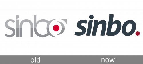
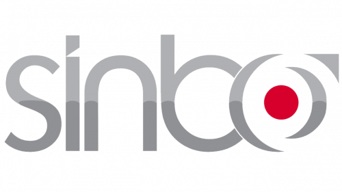
The original Sinbo logo, designed in the 1980s, featured a voluminous gradient silver lettering in the lowercase, executed in a custom sans-serif typeface, with the letter “O” formed by two arched brackets and a triangular pointing upright. The negative space of the letter has a solid red dot in its center. The “O” was overlapping the neighboring “B”.
Today
The Sinbo logo is simple and clever. A dark gray wordmark in the lower-case lettering is complimented by a red dot in the end of the name.
The typeface of the brand’s name is bold and italicized, and looks simple at the first sight, but it resembles of eastern style handwriting with its “S” and “B” letter lines.
The simplicity of color palette adds elegance and style to the logo. Strict dark gray of the wordmark is accompanied by a bright red dot, which adds modernity and style to the whole logo.
The Sinbo logo shows the brand as strong and confident, caring of the quality of its products and the happiness of its consumers.
Font and color
The sleek and smooth lowercase lettering from the primary logo of the Sinbo brand is set in a bold sans-serif typeface, with the characters slightly italicized. The closest fonts to the one, used for this insignia, are Cast Heavy Italic and Myriad Bold Italic.
As for the color palette of the Sinbo visual identity, it is based on a combination of dark blue and dark red shades, which create a stylish and powerful image and evoke such feelings as professionalism, expertise, and reliability. The logo in this color scheme represents the company as the one, focused on quality.


